Introduction
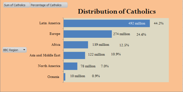
I am showing one of my sons how to use Excel pivot tables, so I am looking for good data analysis examples that illustrate the power of pivot tables. The election of a pope has put Catholicism in the news. The news reports have included numerous discussions about the number of Catholics. I was reading a report on the web by the BBC on the distribution of Catholics around the world that used Figure 1.
I found this graphic interesting. I was surprised at the number of Catholics in Latin America. I started to wonder if I could generate that chart in Excel. Let's get to work ...
Background
The BBC web site says that the data came from the World Christian Database, which requires membership to get their data -- I need to go look elsewhere. It turns out that similar information can be obtained from the Catholic Hierarchy website. Since the databases are different, I would expect to have somewhat different charts. Hopefully, they will be very similar.
Analysis
My analysis process is straightforward:
- Import the web data into Excel
- Assign the countries to the regions used by the BBC
- Create a pivot table of the data
- Create a pivot chart of the data
After going through this process, I obtain Figure 2.
This is pretty close to the graphic presented by the BBC. For those who are curious, I have attached my spreadsheet here.
Conclusion
My chart and the BBC's charts are very similar. This was a good example of a common type of pivot table analysis. I have no doubt that the BBC did something similar to produce their graph.


