Sometimes all it takes is to use a histogram maker to create a graph, for example, to help provide you the clue you need to solve a mystery. Currently, I am working on reducing the failure rate of Avalanche Photo-Diodes (APDs). I found a histogram was useful in my work and I thought I would share it.
APDs are sensitive light detectors. In fact, some can detect individual photons. In my case, APDs are a critical component in the receiver circuit of an optical network. To achieve maximum sensitivity, APDs require a specific voltage be placed across them, which we call the bias voltage. We determine this voltage for each APD during manufacturing through a process we call calibration. The calibration process uses a steepest descent algorithm to the determine the bias voltage that provides maximum sensitivity.
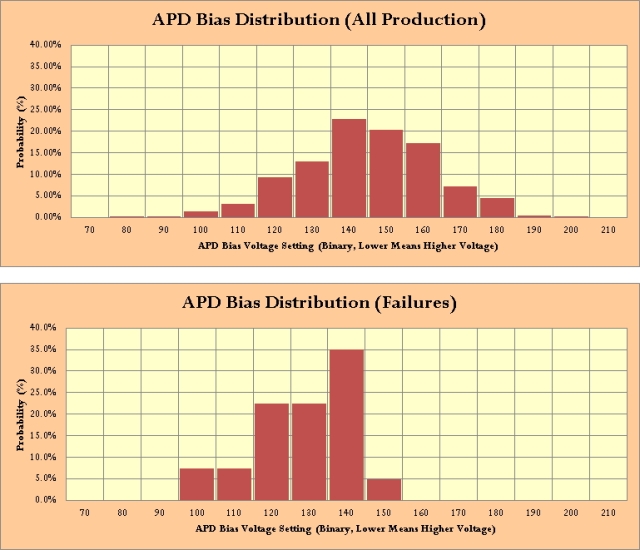
My APD failure rate is too high (still less than 1%) and I need to find out why. I was not making much progress, but then I decided to generate a histogram of APD bias voltages of the failed units and of the general population of APDs we have shipped. This histogram is shown below.
You can see in Figure 1 that the failed units have APD bias voltages that are in the high range of the overall population (high voltage implies low binary setting). I shared this figure with a co-worker and we began discussing why this could be the case. Within a few minutes, we had a number of potential failure causes to check out. I now believe we are on our way to solving our mystery.
I often find myself looking for patterns and regularities in data. Graphs are one of the key techniques we use to see these patterns. In this respect, I do find myself drawn to the work of Tufte. I don't agree with everything he says, but there is a lot of material there that makes me think.

