Quick Look at a High-Power PoE Graph

Quote of the Day

Whatever you are, be a good one.

— Abraham Lincoln


Introduction

Figure 1: Graphic From High-Power PoE Presentation.

Figure 1: Graphic From High-Power PoE Presentation.

I have been sitting in a meeting on a high power version of Power over Ethernet (PoE) known as IEEE 802.3bt. It supports 90 W of output power with a guarantee of 71 W at the load. During the talk, Figure 1 was discussed (my version of the chart). When I am given some mathematical information, I like to experiment with it to see if I understand what I am being told.

In this post, I am going to summarize some quick calculations that I did while sitting in the meeting that helped me understand how this proposed version of PoE transfers power over a data cable. The math shown is simple, but of a type that is very common for a working electrical engineer.

Background

Definitions

Power over Ethernet (PoE)
PoE is IEEE 802.3af/at which supports sending power and data over the same category 5e Ethernet cable, which contains four wire-pairs (i.e. 8 wires total). PoE is enormously popular because only one cable is required to network an Ethernet-fed device, which greatly reduces the cost and complexity of networking remote devices, like cameras. For the version of PoE discussed in this post, power is transmitted over two wire-pairs by applying a DC voltage between each pair (see Figure 1). Superimposing DC on the wire-pairs does not interfere with data transmission because Ethernet uses differential signaling.
Type 1 PoE
Type 1 PoE is an IEEE standard (802.3af) for transferring as much as 13 W over an Ethernet cable.
Type 2 PoE
Type 2 PoE is an IEEE standard (802.3at) for transferring as much as 25.5 W over an Ethernet cable. The standard is also known as  "PoE+".
Power Supplying Device (PSE)
A PSE is a device that provides power on an Ethernet cable.
Powered Device (PD)
A PD is a device powered by a PSE.
IEEE 803.3bt
A proposed version of PoE that can transmit as much as 71 W over an Ethernet cable. The extra power is achieved by using all four available wire pairs (8 wires total).

Post Objective

My objective with this post is to show how a number of important features of the proposed PoE version can be derived from Figure 1.

Analysis

Key Graph Characteristics

Figure 1 is a simple graph:

  • It is linear with a y-intercept of 90 W (the maximum allowed source power) and a slope of -0.19 W/m.
  • The graph ends with a power of 71 W and a range of 100 m, which is the maximum reach guaranteed for 1000Base-T Ethernet.
  • The power source have an output voltage that must be greater than 52 V with a load of 90 W.

We also need know that standard Category 5e (Cat 5e) Ethernet cable is composed of 4 pairs of 24 American Wire Gauge (AWG) wire.

Calculations

Wire Resistance Utility Functions

Figure 2 shows the utility functions that I use to compute the resistance of annealed copper wire as a function of temperature, length, and gauge. I have used these functions for years  – they are based on curve fits of old Bellcore wire resistance data.

Figure 2: Utility Functions for Computing Wire Resistance as a Function of Temperature, Length, and Wire Gauge.

Figure 2: Utility Functions for Computing Wire Resistance as a Function of Temperature, Length, and Wire Gauge.

Resistance Model

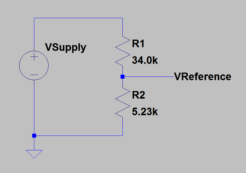
Figure 3 shows the circuit model for this PoE circuit.

Figure M: PoE Resistance Model.

Figure 3: PoE Resistance Model. L is the total length of the wire, R is the total resistance of the wire, and λ is the 2-way resistance of the wire.

Maximum Supply Current (IMax) and Line Resistance Per Meter (λ)

Figure 4 shows how to use Ohm's law with Figure 1 to determine (a) the maximum current on the line, and (b) the two-way resistance of the line per meter, and (c) the wire gauge that meets this resistance requirement. As you would expect, 24 AWG wire meets the requirements for the PoE standard and is the wire gauge used in Cat 5e cable.

Figure 2: Resistivity Implied By Figure 1.

Figure 4: Resistivity Implied By Figure 1.

Minimum Load Voltage

Figure 5 shows how we can compute the load voltage when the cable is carrying the maximum current over the maximum length cable.

Figure 3: Minimum Load Voltage Calculation.

Figure 5: Minimum Load Voltage Calculation.

This is the minimum voltage at which the load's power converter must operate.

Cross-Check Calculations

Figure 6  shows some calculations that demonstrate that my results are internally consistent.

Figure 4: Cross-Check Calculations.

Figure 6: Cross-Check Calculations.

Conclusion

I have always felt that the today's PoE power limits of 15.5 W (type 1) and 25.5 W (type 2) are not adequate for many applications involving MIMO wireless access points. This new standard will be a real boon to customers with wireless coverage issues.

Save

Posted in Electronics, Power Over Ethernet | Comments Off on Quick Look at a High-Power PoE Graph

Chromatic Dispersion with 10 Gigabit Optical Transports

Quote of the Day

The road of life is paved with flat squirrels who couldn’t make a decision.

— Source unknown. Indecision is fatal for squirrels. It is also the most destructive management impairment that I can think of.


Introduction

Figure 1: Illustration of Chromatic Dispersion on a Glass Fiber. A single optical pulse is composed on a range of wavelengths. Because each color travels on the fiber with a slightly different speed, the wavelengths separate as the pulse travels down the fiber.

Figure 1: Illustration of Chromatic Dispersion
on a Glass Fiber. A single optical pulse is
composed on a range of wavelengths. Because
each color travels on the fiber with a slightly
different speed, the wavelengths separate as the
pulse travels down the fiber.

The Fiber-To-The-Home (FTTH) market is preparing to make the transition to a data rate of 10 Gigabits Per Second (Gbps) to and from the home. The current Gigabit PON (GPON) standard support 2.5 Gbps to the home and 1.25 Gbps from the home. One of the challenges we are facing with 10 Gbps is managing chromatic dispersion, which is an  important optical impairment (see Figure 1).

Transmitting information over a glass fiber requires that we use a laser to  modulate the power of the optical signal. To receive the optical signal with a minimum of errors, we need to provide the receiver with (1) an adequate amount of optical power and (2) the bulk of the power for each bit must remain within its assigned bit time. Unfortunately, as the modulated signal travels on the fiber it encounters a number of impairments that reduce its power and spread the power out, which limits the range of the optical system. For PON systems, the most significant impairments are:

In this post, I will be showing how we model the effect of small amounts of dispersion as a power loss. We commonly refer to this power loss at the dispersion power penalty. I will also show how the need to limit the power penalty drives a critical laser parameter, the laser spectral width.

Background

My Quick Description of Chromatic Dispersion

For those who are looking for a quick description of dispersion, I will give you my "elevator pitch" on dispersion in fiber optic communications:

  • Different wavelengths of light move at slightly different speeds along a fiber.
  • Digital signals are sent on a fiber in the form of pulses of optical power.
  • The pulses of optical power are generated by a laser, which produces produces optical power in a narrow range of wavelengths, usually on the order of 0.1 nm.
  • As the pulses move down the fiber, the slower wavelengths of light eventually separate from the faster wavelengths of light.
  • The separation of the wavelengths as they travel down the fiber causes the pulse to spread out. Eventually, the bits begin to merge together and become impossible to separate. Also, the difference in power between a logic 1 and logic 0 begins to reduce, making it impossible to accurately determine whether a time slot contains a 1 or 0.

Definitions

Optical Impairment
Optical fiber is a very good transmission medium, but it is not perfect. It has a number of characteristics that limit its performance, which are referred to as impairments. The usually are broken down into linear and non-linear impairments. Our focus here is chromatic dispersion, which is a very important linear impairment. (Source)
Chromatic Dispersion
Dispersion is a physical phenomenon comprising the dependence of the phase or group velocity of a light wave in the medium on its propagation characteristics such as optical frequency (wavelength) or polarization mode. (Source: ITU G.989.2 standard)
Chromatic dispersion is the result of the different colors, or wavelengths, in a light beam arriving at their destination at slightly different times.  The result is a spreading in time of the on-off light pulses that convey digital information.  Chromatic dispersion is commonplace, as it is actually what causes rainbows – sunlight is dispersed by droplets of water in the air.  In fiber-based systems, an optical fiber, comprised of a core and cladding with differing refractive index materials, inevitably causes some wavelengths of light to travel slower or faster than others. Chromatic dispersion is usually modeled as a combination of material dispersion and waveguide dispersion. (Reference)
Laser Linewidth
A spectral line extends over a range of frequencies, not a single frequency (i.e., it has a nonzero linewidth). In addition, its center may be shifted from its nominal central wavelength. (Source)
Zero-Dispersion Wavelength
In a single-mode optical fiber, the zero-dispersion wavelength is the wavelength or wavelengths at which material dispersion and waveguide dispersion cancel one another. In all silica-based optical fibers, minimum material dispersion occurs naturally at a wavelength of approximately 1300 nm. (Source)

Wavelengths Used

Figure 2 shows the wavelength plans for the various PON standards. GPON (aka G-PON in Figure 2) is the most common PON type deployed in North America.

Figure 2: Good Summary of the Various PON Wavelength Plans.

Figure 2: Good Summary of the Various PON Wavelength Plans. DS means downstream from the central office. US means upstream to the central office from the homes.  PtP means point-to-point and refers to wavelengths dedicated to specific customers. Video refers to the band reserved for NTSC RF video transmissions. (Source)

 Dispersion Power Penalty

There are a number of formulas that are used to model the loss of signal power caused by dispersion. For this post, I will be using Equation 1. I chose this formula because it is the most conservative of the commonly used models.

Eq. 1 {PP _D} = -5 \cdot \log \left( {1 - {{\left( {4 \cdot D \cdot L \cdot B \cdot {\sigma _\lambda }} \right)}^2}} \right)

where

  • PPD is the dispersion power penalty [dB].
  • \sigma _{\lambda} is the spectral standard deviation of the laser [nm].
  • B is bandwidth of the signal [Hz].
  • L is the length of the fiber [km].
  • D is the dispersion constant of the fiber [ps/nm·km].

Equation 1 assumes that the engineer wishes to define the bit time as the period required to contain 95% of the pulse energy at the time of reception. There are lengths that will experience so much dispersion that you will not be able to contain 95% of the pulse energy within the assigned bit time. Mathematically, this means that the expression within Equation 1's logarithm will become zero or negative, which indicates no real solution. I should also make clear that Equation 1 does not model Intersymbol Interference (ISI) – it only models the reduction in bit power.

I like to look at the terms in Equation 1 as shown in Figure 2. I think of dispersion as being a function of two terms: (1) a fiber plant dependent term and (2) a laser transport dependent term.

Figure M: Breakdown of the Dispersion Power Penalty Formula.

Figure 3: Breakdown of the Dispersion Power Penalty Formula.

Figure 3 shows a formula with five variables. In the case of G.989.2, the 10 Gbps portion of the standard specifies four of these numbers indirectly as follows:

  • B = 10 Gbps

    This is the transport data rate and is a fundamental system parameter.

  • D · L  = 24 ps/nm · 20 km = 480 ps/km

    I refer the product of the dispersion constant and the distance as the "dispersion load". It tells you how much delay variance per nm that your system can tolerate. For more information on the dispersion constant, see Appendix A.

  • PPD = 0.25 dB (my allotment to dispersion from the total 1 dB power penalty)

    There a number of optical impairments that reduce the effective power of the transport.

Given these values from the G.989.2 standard, we can determine our laser's maximum allowed spectral width – the objective of this post.

Analysis

Laser Spectra Width Requirement Derivation

Figure 4 shows how I can determine the required laser spectral width assuming the values for B, L · D, and PPD from the ITU specification. The laser spectral width is normally specified in terms of its Side-Mode Suppression Ratio (SMSR) value. We relate the SMSR value, Δλ,  to the σλ using the formula Δλ = 6.07 · σλ. Another common measure of spectral width, Full-Width at Half Maximum (FWHM), has a different conversion factor.

Figure M: Laser Spectral Width Determination.a

Figure 4: Laser Spectral Width Determination.

A laser with  Δλ=0.1 nm is readily obtainable.

Variation of Power Penalty with Distance

Figure 5 shows how the power penalty for a laser with a 0.1 nm spectral width varies with distance.

Figure M: Power Penalty Versus Distance.

Figure 5: Power Penalty Versus Distance.

Conclusion

I was able to determine the required laser spectral width to meet the requirements in the NGPNO2 specification. I then used this spectral width to determine how the dispersion power penalty varies with distance.

Appendix A: Dispersion Constant for SMF-28e Fiber

Figure 6 shows how to determine the dispersion constant SMF-28e using Sellmeier's formula. The model and its constants (S0 and λ0) are given in the SMF-28e datasheet.

Figure M: Dispersion Constant Versus Wavelength for SMF-28e.

Figure 6: Dispersion Constant Versus Wavelength for SMF-28e.

Save

Save

Save

Save

Save

Save

Save

Save

Save

Save

Save

Save

Save

Save

Save

Posted in Fiber Optics | 1 Comment

Using SUMPRODUCT to Evaluate Two-Variable Polynomial

Quote of the Day

Rub my knee coach – I just got kicked in the groin.

— Said by one of my brothers to a trainer while writhing in pain on a football field in front of thousands of people. He did not want everyone in the stadium to know what really happened.


Introduction

Figure 1: Battery Capacity Chart from Innovative Battery Technologies. (Source)

Figure 1: Battery Capacity Chart from Innovative Battery Technologies. (Source)

I occasionally am asked to write Excel-based tools for customer use that have implementation restrictions because of security issues. The most common restriction is that macros cannot be used. This restriction makes sense because macros are an easy way for a hacker penetrate a system, however, macros also make complex algorithms available within Excel. In this post, I will show you how to use the SUMPRODUCT function to implement a polynomial curve fit and avoid the use of a macro.

One of the most common computation tasks that my customers face is estimating battery capacity based on the battery's temperature and discharge current. Figure 1 shows a example of the capacity curves for a typical lead-acid battery. Ten years ago, I chose to implement this function with an Excel spreadsheet that used a polynomial approximation for this function. An engineer today asked me to explain how my Excel implementation works, and I felt this would be a good topic for a post. This approach is implemented using SUMPRODUCT – no helper cells were required.

Background

Generating the Polynomial Approximation

For those curious about how I came up with the polynomial approximation, see this zip file with my Mathcad source, my Excel workbook example, and a PDF of the Mathcad source. The polynomial coefficient were generated using Mathcad's regression function.

The Polynomial

Figure 2 shows the cubic, two-variable polynomial that I implemented in Excel. The x variable is temperature (°C) and the y variable is load current expressed in C-rate.

Figure 2: Cubic Polynomial Approximation for Battery Capacity Versus Temperature (x) and Load Current (y).

Figure 2: Cubic Polynomial Approximation for Battery Capacity Versus Temperature (x) and Load Current (y).

SUMPRODUCT Implementation

Figure 3 shows how I evaluated the polynomial of Figure 2 using SUMPRODUCT. It may look complex, but I put each term on its own line to make understanding it easier. The key to understanding the implementation is to realize that you can (a) capture a range of values within braces, and (2) you can use the brace quantities as exponents.

Figure 4: Description of SUMPRODUCT Implementation.

Figure 3: Description of SUMPRODUCT Implementation.

I also should explain why I divide the function by 97.164%. I normally work with batteries that are specified to operate for 20 hours with a 0.05 C-rate load. I needed to adjust the function to ensure that I would have 100% capacity at a 0.05 C-rate load.

Generating a Table of Capacity Values

We can illustrate the use of this formula by generating a two-dimensional data table of battery capacity values. Figure 4 shows the data table that I generated using the Excel formula of Figure 3

Figure 4: Date Table Example.

Figure 4: Date Table Example.

Ideally, Figure 4 would have had the same values as Figure 5, which was generated using a cubic spline routine of the same data used for determining my regression equation (Figure 2). As you can see, my regression formula is not perfect but it is more than adequate for estimating battery capacity.

Figure 5: Capacity Table of Interpolated Raw Data.

Figure 5: Capacity Table of Interpolated Raw Data.

Figure 6 shows another view of the difference between my regression equation and the capacity curve (Figure 1). My regression formula (colored surface)  roughly follows the data from Figure 1 (round dots).

Figure 5: 3D Plot of Regession Equation (Surface) and Raw Data (points).

Figure 6: 3D Plot of Regression Surface and Raw Data (points).

Conclusion

I often use polynomial approximations to implement empirical functions. While not always very accurate, they are simple to use, quick to implement, and usually accurate enough. In the case of a lead-acid battery, the battery-to-battery variation in capacity is larger than the error in my polynomial approximation.

Save

Save

Save

Posted in Batteries, Electronics | 2 Comments

Open-Drain Comparator Circuit With Settable Trigger and Output Levels

Quote of the Day

If you don't stick to your values when they are being tested, they're not values; they're hobbies.

— Jon Stewart


Introduction

Figure 1: An Open-Drain Schmitt Trigger Circuit with Settable High and Low Output Levels.

Figure 1: An Open-Drain Schmitt Trigger Circuit with Settable Trigger and Output Levels.

I received a circuit design question from a reader who was asking how to design a comparator circuit with controllable trigger points and output levels. I have never encountered this requirement before, but it is a straightforward extension of circuits that I have covered before (example and example).

Figure 1 shows the circuit we will be working with. While simple as circuits go, you will soon see that the algebra can get quite impressive.

For those who want to work with my source, see this zip.

Background

Let's arbitrarily selected some circuit requirements to use for an example:

  • high supply voltage: VCC = 10 V
  • output high voltage: VH = 8 V
  • output low voltage: VL = 2 V
  • rising hysteresis trigger level: {{V}_{{TH\uparrow }}}=4\ \text{V}+0.4\text{ V}
  • falling hysteresis trigger level:{{V}_{{TH\downarrow }}}=4\ \text{V}-0.4\text{ V}

Analysis

Equation Setup

Figure 2 shows how I applied Kirchhoff's voltage law to two circuit states: output voltage high (VO=VH) and output voltage level low (VO=VL).

Figure M: Apply Kirchoff's Voltage Law to High and Low Output Voltage Cases.

Figure 2: Apply Kirchhoff's Voltage Law to High and Low Output Voltage Cases.

Formulas for Resistances

Figure 3 shows how to solve for three of the resistor values (i.e. R2, R3, and R4) in terms of VH, VL, {{V}_{{TH\uparrow }}}, and {{V}_{{TH\downarrow }}}, which are set by specifications. Mathcad was not able to solve for R5 in a displayable form (i.e. too big) using these parameters, but it was able to obtain a reasonably small formula for R5 in terms of R2, R3, R4, VOL, and VL.

Figure M: Solve For Resistance Formulas.

Figure 3: Solve For Resistance Formulas.

Determine Component Values

Figure 4 shows how to determine the component values for this example.

Figure 4: Determine the Comparator Circuit's Component Values.

Figure 4: Determine the Comparator Circuit's Component Values.

LTSpice Modeling

Figure 5 shows how I used LTSpice to capture the schematic and component values for the comparator circuit of Figure 1. The simulation results are exactly as I would have expected. For you schematic artists out there, I know I should have made a fancier symbol for the LM393 – this will have to do because I only had a couple of hours to do all this work.

Figure M: LTSpice Simulation of the Comparator Circuit.

Figure 5: LTSpice Simulation of the Comparator Circuit.

Conclusion

This is a good example of how I usually do circuit design work. I work to develop an analysis model and then move to a simulator once I have an intuitive feel for how the circuit works. I hope this answers the reader's question.

Save

Save

Save

Save

Save

Save

Save

Save

Posted in Electronics | Comments Off on Open-Drain Comparator Circuit With Settable Trigger and Output Levels

Janitor Math

Quote of the Day

To achieve great things, two things are needed; a plan, and not quite enough time.

— Leonard Bernstein. Similarly, Duke Ellington used to say "I don't need time – I need a deadline."


Figure 1: Typical Janitorial Paper Products.

Figure 1: Typical Janitorial Paper Products.

I was working on a Saturday morning when the cleaning crew came in. On this morning, the owner of the cleaning company was with his crew. He stopped by my cube and wanted to speak for a few minutes about some cleaning issues he was seeing. His concerns centered on their increase in workload caused by a recent in the number of workers at our site.

He began the conversation with a statement something like:

You have added quite a few people lately. You have doubled the number of women and increased the number of men by about 10.

We have added a number of people lately, and I was surprised how accurately he knew the numbers. I was a bit curious about how he knew our staffing level and asked him how he figured the numbers of men and women out.

He told me that the number of paper products used by men and women in the bathroom makes the number of people in the building very predictable. He said that every six people using a bathroom means one extra carton of paper towels each month. Additionally, the usage rates of the different types of products vary between men and women. Thus, he was able to accurately estimate how many men and how many women we have added recently. He even told me where the engineers were from based on their toilet seat cover usage. I must admit, I was impressed.

Sometimes, these "rule of thumb" estimates can be uncannily accurate. For example, I once saw a government contract official get wide-eyed when a senior engineer determined a classified number by just making a few routine observations of unclassified information. Of course, he was not supposed to know that number, but a little math and physics gave it to him. This sort of thing happens all the time in the defense business. They even have a name for it – classification of compilations.

Save

Save

Save

Save

Save

Posted in Daily Math | 1 Comment

Interstellar Radio Communication Misfire

Quote of the Day

Do not let what you cannot do interfere with what you can do.

— John Wooden


Introduction

Figure 1: RATAN-600 Radio Telescope. (Source)

Figure 1: RATAN-600 Radio Telescope. (Source)

There were an interesting series of news articles recently about the detection of a possible radio signal from the star HD164595. The actual detection occurred about a year ago (Figure 1 shows the instrument), but it came to the public's attention after an astronomer mentioned it in a recent presentation. Close inspection of the results indicate that the transmission was either from a Russian military satellite or electronic noise sources down on Earth.

These misfires occur occasionally. However, it did provide some interesting calculations of the incredible power required transmit a signal over interstellar distances. I have discussed the power required for a transmitter to receive a low-bandwidth, noise-limited signal in a previous post. For the discussion here, I will confirm some these calculations using the relatively powerful signal detected in this case.

Background

The basic facts of the detection were:

  • From the region of the sky near HD164595, which is 94 light-years away.
  • The signal received had a level of 0.75 Jy (Jansky), which is a fairly strong signal.
  • The receiver has a bandwidth of 1 GHz.

The calculation results that I wish to duplicate are described in this quote about how the signal could have been transmitted from HD164595:

(1) They decide to broadcast in all directions. Then the required power is 1020 watts, or 100 billion billion watts. That’s hundreds of times more energy than all the sunlight falling on Earth, and would obviously require power sources far beyond any we have.

(2) They aim their transmission at us. This will reduce the power requirement, but even if they are using an antenna the size of the 1000-foot Arecibo instrument, they would still need to wield more than a trillion watts, which is comparable to the total energy consumption of all humankind.

Analysis

Figure 2 shows my calculations for the transmit power required from a (a) isotropic radiator – broadcast at all angles, and (b) a beam directed at Earth. The beam is assumed to have the same angular resolution as the Arecibo parabolic antenna (0.028°).

My answers are (1) 0.75·1020 W, and (2) 1.8 TW. Both values are consistent with the calculation results presented in the quote.

Figure 2: My Analysis Required for the Transmit Power Needed from HD164595.

Figure 2: My Analysis Required for the Transmit Power Needed from HD164595.

US Peak Power Generation Arecibo Observatory

Conclusion

I must admit that I was skeptical when I first saw the article. It did not take very long for a more prosaic explanation to be found. At least I found some calculations that were interesting.

Save

Save

Posted in Astronomy | 1 Comment

View of Jupiter From Satellite Metis

Quote of the Day

Successful ... politicians are insecure and intimidated men. They advance politically only as they placate, appease, bribe, seduce, bamboozle or otherwise manage to manipulate the demanding and threatening elements in their constituencies.

Walter Lippmann (1955). Hmm … no change in politicians over the last 61 years.


Introduction

Figure 1: Artist's Conception of the View From a Base on Metis.

Figure 1: Artist's Conception of the View From a Base on Metis. (Source)

The arrival of the Juno spacecraft at Jupiter has motivated me to take a look a closer look at the Jovian system. I was surprised to see that we have cataloged 67 moons, sixteen of which have been discovered since 2003 and are not yet named. One moon that was new to me is called Metis (Figure 2), which is Jupiter's innermost moon. It is very tiny and resides within Jupiter's main ring, where it acts as a shepherd.

Figure 2: Metis Photograph from Galileo Spacecraft.

Figure 2: Metis Photograph from Galileo Spacecraft. (Source)

The Wikipedia's article on this moon had an interesting statement that I thought I would try to verify.

Because Metis orbits very close to Jupiter, Jupiter appears as a gigantic sphere about 67.9° in diameter from Metis , the largest angular diameter as viewed from any of Jupiter's moons. For the same reason only 31% of Jupiter's surface is visible from Metis at any one time, the most limited view of Jupiter from any of its moons.

I was able to confirm the 67.9° angular diameter, but I believe the 31% value is in error and should be 22%. I have posted a comment to the Wikipedia requesting that those folks double-check that number.

P.S. The Wikipedia has removed this statement from the Metis article because it could not be corroborated with a peer-reviewed reference.

Analysis

Geometry

Figure 3 shows the basic Jupiter viewing geometry from Metis. For information on how to compute the viewing area on a sphere in terms of the viewing angle θ,  see the Wikipedia article on spherical caps.

 Figure 3: Visual Geometry of Metis to Jupiter. All dimensions to scale except that of Metis, which would be invisible at this scale.


Figure 3: Visual Geometry of Metis to Jupiter. All dimensions to scale except that of Metis, which would be invisible at this scale.

Calculations

Figure 4 shows my calculations that verify the Wikipedia's statement on Jupiter's viewing angle from Metis. I could not confirm their statement on percent viewable  area, but I believe that I understand where our calculations differ – I obtain their value if I fail to divide the viewing angle by half for the spherical cap area calculation.

I present an alternative form of the percent viewable area formula in Appendix A. You can find further discussion on this form on this web page.

Figure 4: Viewing Angle and Jupiter Viewing Area Calculations.

Figure 4: Viewing Angle and Jupiter Viewing Area Calculations.

Spherical Cap Math

Conclusion

I like to imagine looking up at night and seeing a sky full of a planet. It would be an incredible sight. Unfortunately, Metis is a tiny, cold world that is exposed to an enormous amount of radiation. I cannot imagine humans ever visiting there.

Figure 5 shows a beautiful rendering of the view of Jupiter from Metis.

Figure 5: View of Jupiter from Mitas Using .

Figure 5: View of Jupiter from Metis Using Space Engine. (Source)

Appendix A: Alternative  Percent Viewable Area Formula

A Wikipedia editor commented that I could express the viewable area of a satellite using a simpler formula if I chose a different parameter than the angular diameter. Figure 6 shows percent viewing area formula using the satellite and planet radii as parameters.

Figure 6: Alternative Form of the Percentage Viewable Formula.

Figure 6: Alternative Form of the Percentage Viewable Area Formula.

Save

Save

Save

Save

Save

Posted in Astronomy | Comments Off on View of Jupiter From Satellite Metis

Age of Presidents at Inauguration

Quote of the Day

Imagination is more important than knowledge. For knowledge is limited to all we now know and understand, while imagination embraces the entire world, and all there ever will be to know and understand.

— Albert Einstein


Figure 1: Teddy Roosevelt was the youngest person to serve as president.

Figure 1: At 42, Teddy Roosevelt was the youngest person to serve as president. (Source)

While crawling around the Wikipedia looking for presidential information, I found a list of the ages at inauguration of the US presidents ordered from oldest to youngest. I threw Hillary Clinton and Donald Trump into the list (Table 1) to see where they would place – they are old by historic standards. In fact, Donald Trump would be the oldest ever.

As a check, I computed the inaugural ages of all the presidents using Excel and found that the Wikipedia was accurate, which I normally find true. The age calculation was complicated by the fact that the age system used in Excel does not work for ages before 1900. Fortunately, I found the excellent extended date add-in from Walkenbach, which allows you to work with the string representation of dates. For those of you who like to code,  Excel's VBA does not have the same date restrictions as its workbooks, so you can write your own macros that will work quite well.

Before I dive into the specifics of presidential ages at inauguration, let's look at a histogram of the inauguration ages of all the presidents (Figure 2). Observe that most presidents are between 50 and 60 years old.

Figure 2: Histogram of Presidential Ages.

Figure 2: Histogram of Presidential Ages.

Table 1 shows the age of all the presidents by their age in years and days, plus the ages of Hillary and Donald.

Table 1: List of the Inaugural Ages of the Presidents with Hillary and Donald Added.
President/Candidate Age at inauguration
Donald Trump 70 years, 220 days
Ronald Reagan 69 years, 349 days
Hillary Clinton 69 years, 86 days
William Henry Harrison 68 years, 23 days
James Buchanan 65 years, 315 days
George H. W. Bush 64 years, 222 days
Zachary Taylor 64 years, 100 days
Dwight D. Eisenhower 62 years, 98 days
Andrew Jackson 61 years, 354 days
John Adams 61 years, 125 days
Gerald Ford 61 years, 26 days
Harry S. Truman 60 years, 339 days
Grover Cleveland (2nd Inauguration) 59 years, 351 days
James Monroe 58 years, 310 days
James Madison 57 years, 353 days
Thomas Jefferson 57 years, 325 days
John Quincy Adams 57 years, 236 days
George Washington 57 years, 67 days
Andrew Johnson 56 years, 107 days
Woodrow Wilson 56 years, 66 days
Richard Nixon 56 years, 11 days
Benjamin Harrison 55 years, 196 days
Warren G. Harding 55 years, 122 days
Lyndon B. Johnson 55 years, 87 days
Herbert Hoover 54 years, 206 days
George W. Bush 54 years, 198 days
Rutherford B. Hayes 54 years, 151 days
Martin Van Buren 54 years, 89 days
William McKinley 54 years, 34 days
Jimmy Carter 52 years, 111 days
Abraham Lincoln 52 years, 20 days
Chester A. Arthur 51 years, 349 days
William Howard Taft 51 years, 170 days
Franklin D. Roosevelt 51 years, 33 days
Calvin Coolidge 51 years, 29 days
John Tyler 51 years, 6 days
Millard Fillmore 50 years, 183 days
James K. Polk 49 years, 122 days
James A. Garfield 49 years, 105 days
Franklin Pierce 48 years, 101 days
Grover Cleveland (1st Inauguration) 47 years, 351 days
Barack Obama 47 years, 169 days
Ulysses S. Grant 46 years, 311 days
Bill Clinton 46 years, 154 days
John F. Kennedy 43 years, 236 days
Theodore Roosevelt 42 years, 322 days


Save

Save

Save

Save

Save

Save

Save

Save

Save

Save

Save

Posted in History Through Spreadsheets, Personal | 5 Comments

Asteroid Size Estimation

Quote of the Day

The job of a successful leader is to build relationships that are based on mutual respect and the recognition that others know things that we may need to know to get the job done.

— Edgar Schein. This is as good a description of leadership that I have found.


Introduction

Figure 1: View of 2012 TC4 From Earth.

Figure 1: View of 2012 TC4 From Earth. Note how small and faint the asteroid is in the photo. (Source)

I often see announcements of Near-Earth Objects (NEOs) in the scientific press. For asteroids, these announcements are usually accompanied by a size estimate of the asteroid. In this post, I will discuss a commonly used formula for the effective spherical diameter of an asteroid based on its normalized brightness (i.e. absolute magnitude).

Most asteroids are such small objects that astronomers cannot obtain a large enough image to make a direct measurement. Instead, the astronomers estimate the size of the asteroid by on its range and brightness. Unfortunately, the brightness of an asteroid depends on it surface composition, which is usually unknown when the asteroid is little more than a point of light when first seen from Earth. Astronomers are then forced to give a wide range of possible diameters to account for their surface composition uncertainty.

Background

Definitions

Apparent Magnitude (V)
The visual brightness of an asteroid when observed and measured visually or with a CCD camera. (Source)
Absolute Magnitude (H)
The visual magnitude of an asteroid if it were 1 AU from the Earth and 1 AU from the Sun and fully illuminated, i.e. at zero phase angle – a geometrically impossible situation. (Source)
Geometric Albedo (pV)
The ratio of the brightness of a planetary body, as viewed from the Sun, to that of a white, diffusely reflecting sphere of the same size and at the same distance. Zero for a perfect absorber and 1 for a perfect reflector. (Source)
I smiled when I read this description of geometric albedo – it is VERY similar to the description of target strength as used by the sonar community. I am always amazed at the similarity between the various engineering and scientific disciplines.
Bond Albedo (A)
The Bond albedo is the fraction of power in the total electromagnetic radiation incident on an astronomical body that is scattered back out into space. The Bond albedo is related to the geometric albedo by the expression A=p\cdot q. , where q is termed the phase integral. (Source)
Equivalent Spherical Diameter
The equivalent spherical diameter of an irregularly shaped object is the diameter of a sphere of equivalent volume. (Source)

Key Formula

Equation 1 shows the formula that I see being used in a number of papers.

Eq. 1 \displaystyle D({{p}_{V}},H)=\frac{{1329}}{{\sqrt{{{{p}_{V}}}}}}\cdot {{10}^{{-0.2\cdot H}}}\left[ {\text{km}} \right]

where

  • D is the diameter of the asteroid [km].
  • pV is geometric albedo [dimensionless].
  • H is absolute magnitude of the asteroid [dimensionless].

The detailed derivation of Equation 1 is a bit involved, but quite interesting. See this document for details (section 4.2).

Post Objective

This post will consist of two calculations using Equation 1:

Analysis

Setup

Figure 2 shows my setup for the calculations.

Figure 2: Calculation Setup.

Figure 2: Calculation Setup.

U of I page on asteroids Table of Astronomical Symbols List of Minor Planet Magnitudes and Sizes

Two Asteroid Examples

Figure 3 shows my calculations for the effective diameter of 2012 TC4 and Ceres. My  calculations are in good agreement with the published information.

Figure 3: Calculations for Two Asteroids.

Figure 3: Calculations for Two Asteroids.

Minor Planets Center Table

Figure 4 shows my calculations for duplicating the effective diameter versus absolute magnitude table. Within the rounding used by the Minor Planets Center, I duplicated their results.

Figure 4: My Duplication of the Minor Planets Center Table.

Figure 4: My Duplication of the Minor Planets Center Table.

Conclusion

I was able to use Equation 1 to duplicate a number of results for asteroid sizes. This exercise showed me that it is difficult to get an accurate size estimate for asteroid because their albedos can vary so widely.

Save

Save

Save

Save

Save

Save

Save

Save

Posted in Astronomy | 2 Comments

Calculating a Parameter's Worst-Case Range

Quote of the Day

You have enemies? Good. That means you've stood up for something, sometime in your life.

— Winston Churchill. This is true in both politics and corporate life.


Introduction

Figure 1: Dying Gasp Circuit.

Figure 1: Dying Gasp Circuit.

Many electronic systems are required to generate an alarm when they detect their power failing – the alarm is referred to as a "dying gasp". These systems are required to generate a dying gasp alarm when their input voltage drops below a specified level.

The circuit in Figure 1 provides a typical implementation example. When the input voltage, called VSupply, is at a level where the voltage across R2 drops below VReference, a level that is accurately and inexpensively generated using bandgap voltage reference circuits.

Because of circuit tolerances associated with R1, R2, and VReference, there is a range VSupply values could trigger a dying gasp alarm. In this post, I will show three different ways to determine the range of critical VSupply values. The third method is the most interesting because it involves using feedback in a circuit simulator to solve generate the required supply voltage.

For those who are interested in more dying gasp design details, I addressed how to design a charge storage system to enable the hardware to generate a dying gasp alarm in this post.

For those who are interested, my Mathcad/LTSpice source and its PDF are here.

Background

Definitions

Tolerance
The total amount by which a given dimension may vary, or the difference between the limits. (Source: ANSI Y14.5M-1982)
Worst-Case Analysis
Worst-case circuit analysis is an analysis technique which, by accounting for component variability, determines the circuit performance under a worst-case scenario. (Source)
Extreme Value Analysis (EVA)
EVA involves evaluating a circuit's performance using every possible combination of extreme component value. It is not a statistical method – every possible combination of extreme component value is analyzed.
Root Sum Square Analysis (RSS)
RSS assumes that the design tolerance for a system parameter is composed of the sum of Gaussian distributed variables. Each variable is assumed to have tolerances that can be modeled using a centered normal distribution with the total tolerance range of ±3·σ about the mean. The overall tolerance of a system parameter is estimated by computing the square root of the sum of the squared  variable tolerances.
Monte Carlo Analysis
Monte Carlo analysis is a statistical analysis that calculates the response of a circuit when device model parameters are randomly varied between specified tolerance limits according to a specified statistical distribution. (Source)

Three Approaches

I will use three different ways of determining the range of power supply values that will cause the system to generate a dying gasp.

  • Arithmetic Sum

    This is the traditional approach to worst-case analysis. It produces the absolute maximum and minimum values for a parameter. This approach has two shortcomings: (1) for complex systems, it is difficult to determine, (2) for many system, it produces a result that is so pessimistic that there is no way to make an economically feasible system.

  • Monte Carlo method in Mathcad

    For Monte Carlo analysis, we normally assume that the tolerance of a variable can be modeled using a uniform probability density. We then perform multiple analysis using values randomly generated variable values. This produces a set of output values will approximately reflect the probability density of the real product. The main issue with using Mathcad is that it requires that you have an algebraic solution for the system's response to the input variables. For complex systems, we frequently do not an explicit formula.

  • Monte Carlo method in LTSpice

    Same approach as for Mathcad, but implemented using a circuit simulator. This approach can handle very complex systems that would defeat Mathcad.

I should note that there are other approaches that could be used (e.g. RSS, EVA), but I will focus on the three methods I listed.

Using Feedback to Solve For a Circuit Value

In my third method (LTSpice-based), I use feedback to have the circuit determine the required power supply setting that causes the resistor divider to output the reference voltage. Figure 2 shows a block diagram of how that approach is implemented.

Analysis

Arithmetic

Figure 3 shows the the arithmetic approach. In this case, I applied Kirchhoff's voltage law to the circuit of Figure 1 and determined the supply voltage as a function of the resistor values and the reference voltage. The resulting formula was simple enough that the combination of component values required to produce extreme values could be determined by inspection. This situation rarely occurs in practice, but it occurred today.

Figure 3: Minimum/Maximum Solution Using Arithmetic Approach.

Figure 3: Minimum/Maximum Solution Using Arithmetic Approach.

Monte Carlo in Mathcad

Figure 4 shows how I used Mathcad to perform the Monte Carlo analysis. Observe that the Monte Carlo analysis did not produce as extreme values as the Arithmetic approach. If I used more random iterates, I would get closer to the true minimum and maximum values.

Figure 4: Estimate of Minimum and Maximum Values Using the Monte Carlo Method.

Figure 4: Estimate of Minimum and Maximum Values Using the Monte Carlo Method.

Monte Carlo Method in LTSpice

Figure 5 shows I took the circuit of Figure 1 and used feedback to generate the vSupply value for a given set of R1, R2, and reference voltage values. I ran the simulation for 5000 sets of randomly selected component values.

Figure 4: Using Feedback to Solve For The Critical Supply Voltage.

Figure 5: Using Feedback to Solve For The Critical Supply Voltage.

Figure 6 shows the results of my simulation. As you can see, 5000 simulations were performed.

Figure M: Plot of the Circuit Solutions.

Figure 6: Plot of the Circuit Solutions.

Figure 7 shows a histogram of the results in Figure 5. The results of Figure 6 are consistent with the results of the previous two methods. As the central limit theorem would lead us to believe, the distribution of critical vSupply voltages has a Gaussian shape.

Figure 6: Histogram of the Critical Dying Gasp Supply Voltages.

Figure 7: Histogram of the Critical Dying Gasp Supply Voltages.

Conclusion

I performed a worst-case analysis of a simple comparator circuit using three methods and got three consistent results – as I should have. The LTSpice approach was the most interesting to me because it can be performed using the LTSpice simulator on circuits for which I have no transfer functions.

Save

Save

Save

Save

Save

Save

Save

Posted in Electronics | 3 Comments