I thought it would be interesting going into the details of the associated calculations. Here are the key numbers presented on the webpage:
4 billion pounds of clay-based cat litter per year are used (reasonable number, but no source given).
50,000 pounds of uranium are in this cat litter.
120,000 pounds of thorium are in this cat litter.
To confirm the estimates for the amount radioactive elements, I will use the following radiation measurements made by the web page author:
4 picoCuries (pCi) of 238U radiation per gram of cat litter.
3 pCi of 232Th radiation per gram of cat litter.
8 pCi of 40K radiation per gram of cat litter.
Background
Amount of Clay-Based Cat Litter Manufactured Per Year
The following quote from this web page tells us how much clay-based cat litter is produced in the US every year, which I will need in the calculations to follow.
Clay-based cat litter must be mined. The United States Geological Society estimates that 85 percent of the 2.54 million tons of clay used in this country every year is used for absorption of pet waste, with cat litter being the dominant. There are about 20 companies operating such mines in 10 states.
Basics of Radioactivity Calculations
There are numerous places to learn about how to do calculations involving radioactive materials. On this blog, I have examples on the following posts:
Since I have radiation measurements for each element for a given mass (one gram) of cat litter, I can estimate the amount of uranium, thorium, and potassium in a gram of litter if I know the amount of radiation produced per gram by uranium, thorium, and potassium. Once I know the amount of radioactive element per gram of litter, I can compute the amount of heavy metals disposed of in cat litter per year using the total mass of clay-based cat litter produced per year.
Basic Radioactivity Math
Figure 2 shows how I computed the number of decays per second for each gram of 238U, 232Th, and 40K using the half-life formula. I am assuming that 238U is the dominant source of radiation from uranium, which has a number of radioactive isotopes (e.g. 235U). I demonstrate that this assumption is correct in Appendix B.
Figure 2: Basic Radioactive Materials Math.
I put an independent check on these figures in Appendix A.
Mass of Uranium and Thorium Disposed Per Year
Figure 3 shows how I can take the radiation measurements from the reference article and compute the amount of uranium and thorium present in each year's cat litter production (clay-based only).
Figure 3: Mass of Uranium and Thorium Disposed of Each Year.
Conclusion
I was able to confirm all the figures on the Oak Ridge Associated Universities web page. This is just more confirmation that radiation is all around us.
Appendix A: Check Figures.
Figure 4 shows values for the radiation emission measured from bentonite clay that I found in a research paper.
Figure 4: Listed Radiation Levels for Uranium, Thorium, and Potassium.
To make for easier reading, I have extracted the radiation emission values into the following list.
1 ppm 238U radiates at a rate of 12.4 Bq/kg.
1 ppm 232Th radiates at a rate of 4.06 Bq/kg.
1% K (0.0119% 40K) radiates at a rate of 313 Bq/kg.
In Figure 4, I take the radiation levels that I computed in Figure 2, performed some unit conversions, and I confirm agreement with Figure 5.
Figure 5: Checking My Results.
Appendix B: Decay Contributions of Different Uranium Isotopes.
Figure 6 shows that 238U generates 96% of the decay activity in natural uranium. For the rough analysis being performed in this post, I will assume all the radiation comes from 238U.
Figure 6: Analysis Showing Relative Decay Rates for Uranium Isotopes.
We will hold meetings, everyday, until I find out why no work is getting done.
- Gary Ronneberg, one of my favorite managers.
There must be an enormous amount of money involved in Internet dating because I see their commercials on television all the time. As far as their success in matching people up, I only have one data point – one of my sons met a wonderful gal though the OkCupid online service. My wife and I have been discussing this article that claims that couple compatibility is highly correlated when they have similar answers to the following three simple questions:
Do you like horror movies?
Have you ever traveled around another country alone?
Wouldn't it be fun to chuck it all and go live on a sailboat?
Having the same answer to all three questions must not be required for compatibility – my wife and I have been happily married for 35 years and our answers would be different on all three questions. Compatibility, in my eyes, is more to do with things like personality and pheromones. Pheromones are those chemicals that we produce to attract a mate, so it seems that chemistry has more to do with our compatibility than whether we like horror movies or not.
I'm sure there are many other questions that young people are more likely to ask each other. There'll be the usual stuff that I imagine is more important than both of you enjoying watching Netflix horror movies, like:
How old are you?
Where do you live/where did you grow up?
What's your favourite food?
Do you like cats, dogs or both?
What do you want to be when you're older?
And they're just the basic ones! Teens and young adults these days ask some seriously personal questions - there are no barriers anymore! Examples include:
Are you a virgin/how many people have you slept with?
Would you kiss/sleep with the same/opposite gender?
These are much more likely to be the questions that young people ask each other to determine compatibility. The article also claims that a woman who likes the taste of beer is 30% more likely to sleep with a man on their first date than a woman who does not like the taste of beer. I do not understand that correlation at all and it just leaves me asking - what if the woman does not like men?
Posted inHumor|Comments Off on Dating and Compatibility Correlations
The world is divided into people who do things and people who get the credit.
- Dwight Whitney Morrow
Introduction
Figure 1: A Common Example of Income Inequality.
I recently have been hearing politicians lamenting the growth of income inequality in the United States. These politicians frequently talk about the number of homeless people (Figure 1), but they never talk about how income inequality is defined, measured, or has been changing with time.
I was raised in a small, working-class, agricultural community and I never saw any homeless people when I was growing up. I now live in an affluent community and I see homeless people on some street corners. The "Great Recession" had a devastating effect on many parts of our economy and it is not hard to imagine that it expanded the income gap between rich and poor. The economy goes up and down as society changes, this can be positive or negative depending on the circumstances leading up to these outcomes. With so many using online currency now as a way to make money, this has shifted from the traditional 'wall street' that has been a staple in the economy. Websites such as https://kryptoszene.de/kryptowaehrungen-kaufen/ontology-kaufen/ are flooded with people trying to get into this new way of earning, but how will that affect people with limited money? Can it help them add to it? Support them? Only time will tell. Many people who require an additional financial boost have turned to the lucrative world of cryptocurrencies for help in gaining a source of passive income. One popular solution for doing this is the Bobcat 300 Miner which you can put to work for you, mining crypto in the background. This is ideal for those strapped for cash.
Since I do not believe anything our politicians say without independent confirmation, I have to ask the following questions:
What is income inequality and how is it measured?
How has income inequality been changing over time in the US?
How does the US income inequality compare with other countries?
These are all questions a little math can help with. Let's dig in ...
Background
Definitions
Income Inequality
Economic inequality is the state of affairs in which assets, wealth, or income are distributed unequally among individuals in a group, among groups in a population, or among countries (source).
Lorentz curve
In economics, the Lorenz curve is a graphical representation of the cumulative distribution function of the empirical probability distribution of wealth or income. The curve is a graph showing the proportion of overall income or wealth assumed by the bottom x% of the people (source).
Overview
Figure 2: Photograph of Corrado Gini.
As I began researching income inequality, I quickly discovered that the most commonly used metric for income inequality is called the Gini coefficient, which was developed in 1912 by the Italian economist Corrado Gini (Figure 2). You can find tables and graphs of the Gini coefficient for various countries in a number of places (e.g. OECD).
I subscribe to an excellent economics blog by Jodi Beggs that gives an excellent description of the Gini coefficient. Since she gives an excellent detailed description, I will just give a quick description below and I will refer you to her blog if you want more details. She also has a good Youtube video on the subject, which I embed here.
My Quick Gini Coefficient Briefing
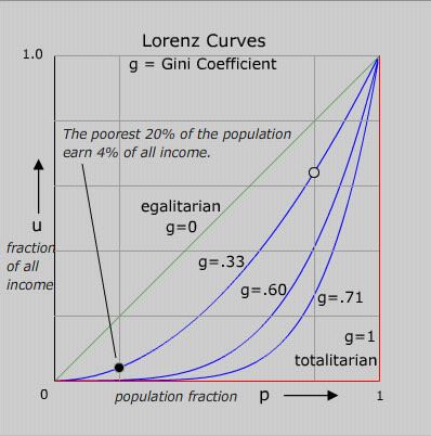
Suppose we examine the income of every individual of a country and arrange the individuals in order of increasing income. If we plot the percentage of national income versus the population percentage (Lorenz curve), we will get a curve like that shown in Figure 3.
Figure 3: Illustration of Gini Coefficient and Its Calculation.
The area of part B represents the total actual national income. Part A by itself represents the loss of national income because everyone does not earn income as the same as the wealthiest people. The areas of parts A and B together represents the national income that would be realized if everyone earned the same amount as the wealthiest person. The closer the country is to an equal income distribution, the smaller the Gini coefficient.
While the Gini coefficient is well-defined and its calculation is straight-forward, the definition of national income in not. Agencies use different measures of national income ? here are a few examples:
pre-tax income
post-tax income
income without government transfer payments
income with government transfer payments
The difference between pre- and post-tax results is particularly dramatic for high-tax countries. The Wikipedia actually lists both post- and pre-tax Gini coefficients from a number of agencies: World Bank, UN, and CIA.
Figure 4: Interesting Cases of the Gini Coefficients.
Figure 4 presents a number of interesting special cases of the Gini coefficient. No country is perfectly egalitarian nor perfectly totalitarian. However, it is interesting to look at the Gini coefficients for places like Sweden (23%, close to egalitarian) and South Africa (63.1%, close to totalitarian). It does not surprise me that the Scandinavian countries all seem to be close to egalitarian. I live in Minnesota, which has strong connection with Scandinavian culture, and our politics has a strong egalitarian feel.
The Gini coefficient is not the only metric for income inequality. Here are a few other metrics that economists and politicians may use to educate or confuse us.
Figure 5 shows how the Gini coefficient of the US has varied over time. We have definitely seen a significant rise over the last 40 years. This is most likely due to the introduction of technology and how easy it is for those already obtaining a portion of wealth to invest with forex apps uk among the likes of from any location with internet connection. Making money is no longer confined to office hours. Nowadays, money can be made from a number of different avenues, such as investments or even by playing some casino games. By using a live mobile casino, people can play different games in the hopes of winning some more money for themselves. This means that people can make more money from the comfort of their home.
Figure 5: US Gini Coefficient Over Time.
Figure 6 shows how the US Gini coefficient compares with other countries and how it has varied over time. Notice China's rise in income inequality. When I travel in China, I have heard concerns expressed by the people there about the rising income inequality.
Figure 6: Change in Gini Coefficient for Various Countries Over Time.
Mathematical Definition of Gini Coefficient
The Wikipedia has an excellent discussion of how you can compute the Gini coefficient, but I am going to use a very simple approach with no simplifications.
Eq. 1
where
f(x) is the Lorentz curve for country of interest.
x is the population percentage
Analysis
Economic Data
Figure 7 shows the Lorenz curves for the US in 1968 and 2010. I will digitize this graph using Dagra and evaluate the Gini coefficient using Mathcad.
Figure 7: Lorenz Curves for the US in 1968 and 2010.
Calculations
Figure 8 show how I computed the Gini coefficient. There are numerous simplifications that can be made when computing the Gini coefficient ? I used none of them.
Figure 8: Gini Coefficient Calculations for the US.
My computed values have an error of about 1% from the reported Gini coefficients for 1968 and 2010 – not bad agreement considering the errors in digitizing off of an image.
Conclusions
I was able to understand how income inequality is defined, computed, and how it has changed for various countries over time. The US has clearly seen a rise in income inequality.
You're off to great places! Today is your day! Your mountain is waiting, So... get on your way!
— Dr. Seuss (Oh, the Places You'll Go!)
Introduction
Figure 1: Mars Spacecraft from "Conquest of Space".
Figure 2: Curiosity Rover.
I recently re-watched a 1955 science fiction classic, Conquest of Space (Figure 1). For its time, the movie had great special effects and an abysmal plot – the movie died at the box office. In the movie, the main space risks the astronauts faced were from meteroids and asteroids. Today, we know that meteroids and asteroids are probably less of a problem for astronauts than the long-term effects of radiation exposure.
To develop a better understanding of the risks associated with the radiation exposure, I have been reading an article on the radiation levels measured by the Mars Science Laboratory (MSL) named Curiosity (Figure 2). One of the many scientific objectives of this mission has been to determine the types and levels of radiation present in deep space and on Mars. A sensor called the Radiation Assessment Detector (RAD) is mounted on Curiosity and has been gathering radiation information throughout its mission, including during the space cruise phase (see Appendix A for more details on the sensor). This research is required by engineers who will be designing spacecraft and habitats that will provide explorers with adequate levels of radiation protection.
My objective here is to review this article and see if I can understand some of the details it presents. My focus will be on the following quote and understanding the numbers that it contains:
Combining cruise and surface measurements, the RAD science team estimates a Total Mission Dose Equivalent of 1.01 Sievert for a flight to Mars consisting of a 180-day cruise to the planet, a 500-day stay on the surface and a 180-day flight back to Earth.
Background
Risk Definitions
Relative Risk [RR]
Relative Risk (also called Risk Ratio) measures the magnitude of an association between an exposed and non-exposed group. It describes the likelihood of developing disease in an exposed group compared to a non-exposed group. From a formula standpoint, it can be written as , where pdisease when exposed is the probability of developing a disease when exposed to a radiation event, and pdisease when not exposed is the probability of developing the disease when not exposed to the radiation event.
Excess Relative Risk [ERR]
Excess Relative Risk and RR are related by the formula .
Unit Definitions
Definitions of Radiation Doses
There are many definitions associated with radiation dosage, which I have discussed in a previous post. I am repeating the key definitions here.
Energy absorbed by a kg of a substance. The absorbed dose is represented symbolically by DT,R, with T representing the specific tissue (e.g. brain) and R representing the specific type of radiation (e.g. x-ray). Absorbed dose is measured in units of Gray (Gy). By definition, 1 Gy = 1 joule/kg.
Equivalent dose is the absorbed dose weighted by the effect of the different types of radiation. The equivalent dose is represented symbolically by HT and computed by the formula , where wR represents the weighting for radiation effects relative to x-rays (wX-Rays=1). Equivalent dose is measured in units of Sieverts (Sv).
Effective dose is the equivalent dose weighted by the radiation sensitivities of the different tissues. The effective dose is represented symbolically by E and computed by the formula , where wT represents the weighting for tissue radiation sensitivity. The tissue radiation sensitivity is normalized so that weights for all tissues sum to 1. Effective dose is measured in units of Sieverts (Sv).
Radiation Dose Units
Sievert
The Wikipedia defines the Sievert (symbol: Sv) as the SI derived unit of equivalent radiation dose. The Sievert represents a measure of the biological effect, and should not be used to express the unmodified absorbed dose of radiation energy, which is a physical quantity measured in Grays.
Gray
The Gray (symbol: Gy) is the SI derived unit of absorbed dose. Such energies are typically associated with ionizing radiation such as X-rays or gamma particles or with other nuclear particles. It is defined as the absorption of one joule of such energy by one kilogram of matter.
NASA Policy on Radiation Exposure
NASA policy is to limit the an astronaut's lifetime increased cancer risk to 3% (source). It turns out that this limit will be tough to meet unless special precautions are taken. NASA based their ERR on a graph that I have included in Appendix B.
Basic Mission Profile
NASA's radiation estimates assumed the following mission profile.
180 days cruise time to Mars
500 days on Mars
180 day cruise time to Earth
These durations can be moved around a bit. See this web page for a readable explanation of why the mission takes this long, but the short answer is that this mission profile allows you to launch the most payload with the least energy. The Wikipedia page on Hohmann transfer orbits also does a nice job explaining the theory.
I will assume that the radiation exposure to and from the Earth will be the same. In fact, the Sun has a solar cycle that will cause its radiation contribution to vary with time and there always is the possibility of a random solar flare.
Analysis
Variation of Martian Surface Radiation Levels
All the data presented here is from Curiosity's RAD sensor. The Mars surface data were measured at Curiosity's relatively limited locations. Radiation levels do vary over the Martian surface because Mars' surface atmospheric density varies significantly.
While Mars has a much thinner atmosphere than we have on Earth, the atmospheric density at the surface has a wider percentage variation than we experience on Earth's surface (detailed discussion). Because the atmosphere provides some level of radiation shielding, this means that the radiation exposure that the astronauts experience will vary over the whole planet. Figure 3 illustrates this fact.
Figure 3: Radiation Variation Over the Surface of Mars.
Compute the Cruise Absorbed Dose Rate
Effect of the Ground
If we ignore the effects of the Martian atmosphere, the following quote tells us that the absorbed dose rate during the cruise phase will be on the order of twice of the surface measurement because the ground shields you from half the possible radiation angles.
The cruise rate is significantly higher because on Mars the lower hemisphere of the instrument is shielded by the planet and the atmosphere provides more effective shielding than the MSL spacecraft. During Cruise, RAD was only protected by the MSL spacecraft structure (rover, aeroshell, backshell & cruise stage) and particles could reach the instrument from all directions.
Because the atmosphere does attenuate some radiation, the surface absorbed dose rate will actually be less than half that of the space cruise absorbed dose rate.
Compute the Cruise Absorbed Dose Rate
The following quote tells us that RAD receives radiation from all angles during the cruise phase.
During cruise, a rate of 0.48 (+/-0.08) mGy/day was measured.
The article does not give use a graph of the daily absorbed dose rate, but it does give us the following graph (Figure 4) of particles versus linear energy transfer.
Figure 4: Energy Profile of Mars Radiation.
We can use this graph to verify their 480 µGy/day absorbed radiation rate as shown in Figure 5. I digitized the NASA data using Dagra and processed it with Mathcad. My calculations generated a value of 490 µGy/day, which I think is pretty close considering the rough curve fit I used.
Figure 5: Computation of the Absorbed Dose Rate During the Cruise to Mars.
Surface Absorbed Dose Rate
The following quote tells us the that the average absorbed dose rate on Mars measured by Curiosity was 210 µGy/day.
Overall, RAD measured an average total dose rate at Gale Crater of 0.21 (+/-0.04) mGy/day.
Figure 6 shows the raw absorbed dose radiation readings for 300 martian "sols".
Figure 5: Curiosity Radiation Measurements from Mars Surface.
We can see on Figure 6 that the 210 µGy value is correct.
Total Dose Mission Dose Rate
The article does not give me enough information to compute the equivalent dose per day, which requires information on how they weighted the effects of radiation with different energy levels. However, the article does tell me their daily equivalent dose rates for both the cruise (1.8 µSv/day) and Mars surface periods (0.64 µSv/day). For my assumed manned mission profile, this means the total radiation exposure can be computed as shown in Figure 7.
Figure 7: Total Dose Calculation.
The article states 1.01 Sv for the mission equivalent dose level. So my calculations are roughly correct. Other references (example) actually state 1.1 Sv, so I wonder if the 1.01 Sv in this article might be a typo.
Increased Cancer Risk
Using the graph shown in Appendix B, we can see that 1.1 Sv of radiation exposure for a middle-aged astronaut means a ~5% increase in the cancer expectations. This exceeds NASA's current 3% lifetime limit.
Conclusion
I was able to use the graph of the radiation energy spectrum to compute the total absorbed radiation dosage. However, I was not able to find enough information to allow me to convert the absorbed radiation dosage numbers to equivalent dose levels. I will continue to hunt for this information, but it may take a while to find.
Figure 8 shows the radiation sensor that is on the Curiosity Mars probe (source).
Figure 8: Curiosity Mars Probe's Radiation Sensor.
(A) Photo of Actual Sensor.
(B) Cross-Section Diagram of the Sensor.
The energy coverage of the sensor is illustrated by Figure 9 (source).
Figure 9: Radiation Coverage of the RAD Sensor.
The following video is a good briefing on the sensor.
Appendix B: Radiation Effects Model
Figure 10 shows a common model (ICRP 60) for radiation the Excess Relative Risk (ERR) per Sv. This graph shows that that average ERR per Sv is 5%, which assumes an astronaut in the 40-50 year age range.
Figure 10: ICRP Publication 60 (1990) Model for Radiation Effects.
NASA is estimating that an astronaut will receive ~ 1 Sv of radiation on their baseline Mars mission time profile.
The ultimate test of a moral society is the kind of world that it leaves to its children.
— Dietrich Bonhoeffer
Introduction
Figure 1: The Ghost Pepper.
A friend of mine loves the heat of peppers – I only ate one thing he ever gave me and I thought I was going to be a victim of spontaneous human combustion. To maximize the heat in his food, he even cultivates his own ghost peppers (Figure 1), which some describe as the hottest of all the peppers.
We have talked quite a bit about peppers and how their heat is measured using the Scoville scale. The heat is all tied to the amount of capsaicin in the chilli. I even documented one of our early discussions in this post.
A measurement of one part capsaicin per million corresponds to about 15 Scoville units, and the published method says that ASTA pungency units can be multiplied by 15 and reported as Scoville units. Scoville units are a measure for capsaicin content per unit of dry mass.This conversion is approximate, and spice experts Donna R. Tainter and Anthony T. Grenis say that there is consensus that it gives results about 20–40% lower than the actual Scoville method would have given.
I never like to see the word "about" in a technical definition. My objective in this post is to show that the unit conversion of "one part capsaicin per million corresponds to about 15 Scoville units" is consistent with measured values of capsaicin in actual chilies.
Background
Figure 2: Wilbur Scoville, Inventor of the Scoville Scale.
The Scoville scale was invented by Wilbur Scoville, an American Pharmacist. The original method used to determine the Scoville measure of a pepper used human testers and would follow the process described below (source).
In Scoville's method, an alcohol extract of the capsaicin oil from a measured amount of dried pepper is added incrementally to a solution of sugar in water until the "heat" is just detectable by a panel of (usually five) tasters; the degree of dilution gives its measure on the Scoville scale. Thus a sweet pepper or a bell pepper, containing no capsaicin at all, has a Scoville rating of zero, meaning no heat detectable. ...The greatest weakness of the Scoville Organoleptic Test is its imprecision, because it relies on human subjectivity. Tasters taste only one sample per session.
I thought that I would take a look at a study of some peppers and determine my own relationship between capsaicin level and the Scoville scale.
Analysis
Approach
My approach is to grab some measured pepper data from a research paper and do a bit of regression on the results.
Raw Data
Figure 3 shows some raw chili data from this research paper.
Figure 3: Empirical Data for Various Chilies.
Regression
Figure 4 shows my linear regression between Scoville units and capsaicin and dihydrocapsaicin levels using Excel . Note that the p-values tell us that only capsaicin is important with respect to the Scoville number.
Figure 4: Linear Regression with Capsaicin and Dihydrocapsaicin.
Notice the coefficient for the capsaicin term is 16.05. This is "about 15".
Conclusion
I was able to show that for the data at hand, 16.05 Scoville units equals 1 μgram capsaicin per 1000 grams of dry pepper. This is consistent with the "about 15" number that is frequently quoted.
It may be an unwise man that doesn't learn from his own mistakes, but it's an absolute idiot that doesn't learn from other people's [mistakes].
— Frasier Crane
Figure 1: Common 63Sn/37Pb Solder (Melting Point 183 °C ).
Just before lunch, some of the hardware folks here were having a discussion about a Printed Circuit Board (PCB) issue that had come up and how we had solved this issue in the past. During this discussion, one of the hardware managers reminded me of how he cleverly resolved a part problem we had a few years ago by using solders with different melting points. At the time, I thought his solution was brilliant and it saved us a bunch of time and money. His solution is worth documenting here.
Figure 2: No Lead Solder, 99.5/0.5 Sn/Cu (Melting Point 227°C).
The problem we had a few years ago involved a complex circuit card with a layout that assumed a specific memory part. After we had fabricated the PCB but before we had soldered parts on it, a problem was discovered with a component and we needed to use an alternative device. Unfortunately, all potential substitutes had a different pin configuration than the part that the PCB was designed for. The substitute parts had the same pins, but in different positions. We did not have time to design and fabricate a new version of the complex PCB. The path to a clever solution began with asking the right question.
The question was, "What if we made a small, quick-turn, PCB that would connect the alternative part's pins to the pin positions of the faulty part?" This approach would work, but how would we align and solder a pair of PCBs together at the same time?
His clever answer was not to solder them together at the same time. We could solder the substitute part to the small PCB using high-temperature solder (Figure 2: no lead, melting point 227 °C) and then solder the bottom of the small board to the large board using low-temperature solder (Figure 1: leaded, melting point 183 °C).
Over a period of a few days, we designed the small PCB, fabricated it, and soldered our alternative part onto its top surface. We then used low-temperature solder to attach the small board in place of the faulty part. The high-temperature solder did not reflow when the small PCB was placed on the large PCB and everything worked perfectly.
Figure 3 illustrates the small circuit board and different solders that we used to solve our part substitution problem.
Figure 3: Solving An Interconnect Problem Using Different Solders.
Figure 4 shows the actual, small PCB that we built to solve our problem. Sorry for the poor photography – all I have is my phone.
Figure 4: Small PCB to Fix Interconnect Issue.
Posted inElectronics|Comments Off on Clever Use of Different Solder Melting Points to Solve a PCB Problem
Negative results are just what I want. They're just as valuable to me as positive results. I can never find the thing that does the job best until I find the ones that don’t.
— Thomas Edison. This comment reflects the experimental nature of Thomas Edison's work style. Tesla used to complain that a little bit of analysis would have saved Edison huge amounts of time and expense.
Figure 1 shows a typical PCB, which often contain parts with rows of pins/pads that are supposed to be separated by a fixed distance, called the pitch (symbol P), which is illustrated in Figure 2.
Figure 2: Example of Electronic Component Dimensions.
I have seen this problem a couple of times a year every year for the last 25 years. In the old days, both the electronic components and the PCBs were designed using US customary units, so there were no unit conversion issues. Today, all new parts are designed using metric units, but the PCBs are often designed and built using US customary units. This means that unit conversion is part of the design process.
I REALLY do not like US customary units and if I ruled the world everything would be metric. However, some older parts are still used that were designed using customary units and many people in the US prefer to use units they are familiar with. This means that unit conversion is a fact of life.
My policy is that all unit conversions are done with five significant digits. Unfortunately, the CAD layout software uses three decimal places by default and the CAD person forgot to change the default value. A pitch of 0.6 mm (exact) converted to inches using three decimal places means there were only two significant digits (0.024 in). It provides little consolation to know that we are not the only folks to have unit problems (i.e. NASA Mars Climate Orbiter).
I will illustrate the issue using the 200 pin connector (100 pins on a side) shown in Figure 3.
Figure 3: Connector with 0.6 mm Pitch with 100 Pins on a Side (200 Pins Total).
Problems arise when you have a large number of pins in a row (e.g. 100) and there is a small error in the conversion from mm to inches. That error gets multiplied by 99 (i.e. the 100th pin is 99 pins distant from the first) over the length of the connector and can result in the connector pins/pads not matching up with the PCB holes/pads.
Figure 4 contains an analysis that shows that using two significant digits (three decimal places) results in significant pin misalignment but five significant digits (six decimal places) has minimal error.
Figure 4: Calculation That Shows Two Significant Digits Are Not Sufficient.
It is not unusual to have more than 100 pins on a side, which just makes the problem worse.
Postscript
Many thanks to Paul Campbell of Beloit College for some excellent comments that were privately emailed.
Posted inElectronics|Comments Off on Unit Conversion and Significant Digits
I am not a fast reader, I am a fast understander.
— Isaac Asimov
Introduction
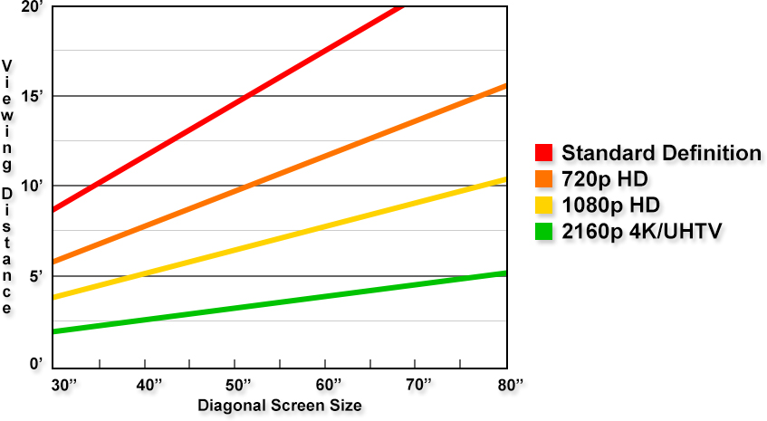
Figure 1: TV Viewing Distance Versus Resolution.
My wife has said that we are going to move into the 1990s and buy a High-Definition TV (HDTV). I am not an early adopter of any technology. Yes, I have been called a Luddite.
Among the many features to choose is the screen size. The television will go into a room that has a maximum viewing distance of 10 feet. How do we go about choosing the the screen size? I told my wife that that there are many approaches to determining the proper viewing distance. I thought I would document this discussion here. While her eyes glazed over about half-way through the discussion, you might find it more interesting – you are reading a math blog after all.
Figure 1 shows a commonly seen chart of the size of the screen versus versus viewing distance. I will show how to generate this chart for yourself. I will derive an expression for the minimum viewing distance assuming that you want the television's pixel detail to be indiscernible to the human eye.
Background
Television Basics
I covered most of the basics of television in this post and I will refer you there if you want to know more about pixels and resolution.
Viewing Distance Theories
The Wikipedia has an excellent discussion of this topic and I will refer you to that article for all the nuances associated with this topic.
The most common approaches that I see people use for determining the proper viewing distance are based on:
A slight variation on the fixed viewing angle approach in that they recommend 28° to 40°.
I will focus on the human visual acuity standard – we want the television to be far enough away that we cannot see the discrete (i.e. pixel) nature of the display.
Analysis
Key Equation
Equation 1 is the key formula here.
Eq. 1
where
NV is the number of vertical pixels (see Figure 2a).
Figure 2 illustrates the key parameters used in my analysis.
Figure 2(a): Television Parameters.
Figure 2(b):Viewing Parameters.
Figure 3 shows my derivation of a formula for the minimum distance to a television based on visual acuity.
Figure 3: Derivation of Equation 1.
Results
Figure 4 shows a plot that I made of Equation 1. You can see that it is very similar to Figure 1.
Figure 4: Equation 1 Plotted Similarly to Figure 1.
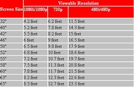
This information is often presented in the form of a table. I show how to use Equation 1 to build a table of this information in Appendix A.
Conclusion
This is a quick summary of a discussion that my wife and I had this weekend. As a result of this discussion, we will be buying a 65-inch HDTV very shortly.
Appendix A: Alternative Presentation
Sometimes you will see this information presented in form, as I show in Figure 5.
Figure 5: Example of a Typical Viewing Distance Table.
Figure 6 shows my presentation of the same information computed using Equation 1.
Figure 6: My Calculation of the Info Shown in Figure 5.
Present to inform, not to impress; if you inform, you will impress.
— Fred Brooks
Introduction
Figure 1: Photograph of Mount Chimborazo.
I have a boring task that requires that I be able to access a geographic database to gather a large amount of information. There are numerous databases out there, but the Wikipedia Geonames database is the one I would really like to learn how to use – it is large and free. I am not particularly skilled at web scraping and I have been procrastinating on my task for a while. I need a interesting problem to drive my interest.
Yesterday, I was reading about Mt. Everest on the Wikipedia when I saw the following statement that aroused my curiosity about the shape of the Earth.
The summit of Chimborazo in Ecuador is 2,168 m (7,113 ft) farther from Earth's centre (6,384.4 km (3,967.1 mi)) than that of Everest (6,382.3 km (3,965.8 mi)), because Earth bulges at the Equator.[6] This is despite Chimborazo having a peak 6,268 m (20,564.3 ft) above sea level versus Mount Everest's 8,848 m (29,028.9 ft).
Mount Chimborazo is shown in Figure 1. While I have never heard of this mountain before, it apparently has the distinction of having a summit that is as far from the center of the Earth as a point on land gets.
I can see a little math here and now I start to stir. What if I constructed a list of the mountain peaks furthest from the center of the Earth? That would give me a problem that I am interested in that would also allow me to learn how to use the Geonames database.
Let's dig in ...
Background
Objective
My goal is generate a table of mountain heights sorted from by distance from the center of the Earth. While accomplishing my goal, I will also:
learn how to grab data from the Geonames database.
learn a bit about geodesy – the study of the shape and gravitational field of the Earth.
All of my work today will be done in Excel and I will provide a link to my spreadsheet at the end of this post. There will be a small Visual Basic for Applications (VBA) program used with Excel to access the data.
Definitions
A big part of this effort is getting all the terms defined. Here are the definitions that I used.
Reference Ellipsoid
In geodesy, a reference ellipsoid is a mathematically defined surface that approximates the geoid, the truer figure of the Earth, or other planetary body. Because of their relative simplicity, reference ellipsoids are used as a preferred surface on which geodetic network computations are performed and point coordinates such as latitude, longitude, and elevation are defined (source).
Ellipsoid Height
The height of an object above the reference ellipsoid in use. This term is generally used to qualify an elevation as being measured from the ellipsoid as opposed to the geoid. GPS systems calculate ellipsoidal height (source).
Geoid
Earth's geoid is a calculated surface of equal gravitational potential energy and represents the shape the sea surface would be if the ocean were not in motion (source).
Mean Sea Level
Sea level is generally used to refer to Mean Sea Level (MSL), an average level for the surface of one or more of Earth's oceans from which heights such as elevations may be measured. MSL is a type of vertical datum – a standardized geodetic reference point – that is used, for example, as a chart datum in cartography and marine navigation, or, in aviation, as the standard sea level at which atmospheric pressure is measured in order to calibrate altitude and, consequently, aircraft flight levels (source).
Ocean Surface Topography
Measurement of the sea surface height relative to Earth's geoid. The height variations of ocean surface topography can be as much as two meters and are influenced by ocean circulation, ocean temperature, and salinity (source). I will not be concerned with these variations in this post.
Orthometric Height
The orthometric height of a point is the distance H along a plumb line from a point to the geoid. Orthometric height is for all practical purposes "height above sea level"(source).
Key Parameters
Figure 2 shows the relationship between the key parameters of mean sea level, ellipsoid height, and geoid height.
Figure 2: Graphic Description of the Key Parameters.
Analysis
Information Required
Here is the information that I need to gather:
list of mountains taller than 5500 meters – my arbitrarily chosen limit – with their elevations.
latitude and longitude for each mountain
geoid correction factor for each mountain
Plan of Attack
The following list details my process for solving this problem:
Gather a list of mountains taller than 5500 meters.
Fortunately, the Wikipedia has an excellent list of mountains in order of height. To use the database, I need to ensure that I have the mountain names in my list EXACTLY like they are in the Geonames database
Write a VBA program to access the Wikipedia data.
Because a small number of Wikipedia geographic entries do not location data (i.e. latitude and longitude) in their database, I will need to flag these entries for manual lookup. I will simply leave locations with no latitude and longitude tied to the name blank. I can then search for blank entries to locate them.
Look up the missing information using Google searches.
This was a bit slow because I had a difficult time locating some of the shorter mountains on the maps.
This program is fed a text file of coordinates and it gives you back the geoid correction to the ellipsoid used to approximate the Earth's shape.
Compute the distance from the center of the Earth using a formula from this web site, which also does an excellent job deriving the formula.
I needed to convert Equation 1 into an Excel formula. Not hard, but you have to be very careful because long formulas in Excel are painful.
Sort the list from most distant to least distant from the center of the Earth.
This gives me the result that I wanted, which I can compare to other sources on the Internet.
Gather the Data
Grab Latitudes, Longitudes, Elevations
I have written an Excel workbook that will obtain the latitude and longitude for the mountain names in my list of highest peaks. The workbook contains a VBA routine that will:
read each mountain name from a table of names.
send a request to the Geonames server for the XML data for that name.
parse the returned text to separate out the latitude and longitude values.
write the latitude and longitude values to the table column assigned to hold the return value.
About 10% of the mountains do not have an entry in the Geonames database. There are various reasons for this:
Mountains like Annapurna have multiple peaks with names that are not in the Geonames database (e.g. Annapurna II).
Some mountains are missing location data in the database (e.g. Guli Lasht Zom).
To run the routine, you must make sure that your VBA includes a reference to "Microsoft XML, 6.0". You need to go into the VBA IDE (Alt-F11), click on the Tools menu, and click on the References. You will see Microsoft XML, 6.0 there and you need to check it.
My routine runs when the button is clicked. The routine concatenates string versions of the latitude and longitude data using "|" as a delimiter. I can then use Excel's Text-to-Column function to separate the latitude and longitude. A bit crude, but it works well enough for this one-time instructional exercise.
The Geonames database requires that you have a user name. There is a cell in the workbook for your username. I have removed mine.
Compute the Geoid Corrections
Now that I have the latitudes and longitudes of the mountain summits, I can run a free tool, called intptdac.exe, to generate the geoid corrections. The program could not be any simpler to run:
create a list, called Input.dat, with two columns of data
first column contains latitude data (North positive)
second column contains longitude data (360° format, positive going East)
Run intptdac.exe
A text file is created, called outintpt.dat, that has three columns: latitude, longitude, geoid correction.
Calculation of the Distance from the Center of the Earth
I have used Equation 1 that was beautifully derived on this web site to determine the distance from the center of the Earth.
Eq. 1
where
D is the distance to the center of the Earth [m]
is the latitude of the mountain summit [°]
Z is the height above mean sea level [m]
G is the geoid height [m]. Note that G is a function of latitude and longitude.
a is the semi-major axis of the Earth reference ellipsoid (a= 6378137 m)
b is the semi-minor axis of the Earth reference ellipsoid (b= 6356752.3 m)
Results
Table 1 shows the 28 mountains with summits furthest from the Earth's center. The spreadsheet has a much larger list of 210 mountain summits.
Table 1: 25 Mountains with Summits Furthest from Earth's Center
Name
Latitude
( °)
Longitude
(°)
Geoid
(m)
Elevation
(m)
Distance
(km)
Chimborazo
-1.469167
-78.817
25.96
6267
6384.4
Huascarán Sur
-9.122
-76.604
21.02
6768
6384.4
Huascarán Norte
-9.1217
-76.604
21.01
6655
6384.3
Yerupajá
-10.267
-76.9
25.64
6635
6384.1
Cotopaxi
-0.6841
-78.438
27.46
5897
6384.1
Huandoy
-9.0273
-77.6628
20.63
6395
6384.0
Kilimanjaro
-3.0758
37.3528
-16.26
5895
6384.0
Cayambe
0.029
-77.986
24.45
5790
6384.0
Antisana
-0.485
-78.1408
26.06
5753
6383.9
Siula Grande
-10.2947
-76.8917
25.78
6344
6383.8
Alpamayo
-8.8789
-77.6536
18.96
5947
6383.6
Nevado Pisco
-9.0016
-77.6292
20.38
5752
6383.4
Salcantay
-13.3336
-72.5444
42.59
6271
6383.3
Pico Cristóbal Colón
-10.838
-73.687
27.24
5776
6383.2
Coropuna
-15.5203
-72.6572
43.61
6425
63823.1
Janq'u Uma
-15.8533
-68.5408
46.18
6427
6383.0
Illampu
-15.8167
-68.5333
46.02
6368
6383.0
Illimani
-16.6539
-67.7847
41.82
6462
6382.9
Ampato
-15.8167
-71.8833
44.08
6288
6382.9
Nevado Sajama
-18.108
-68.883
44.28
6542
6382.7
Chachakumani
-15.9858
-68.3817
45.83
6074
6382.6
Wallqa Wallqa
-15.8167
-71.8833
44.08
6025
6382.6
Huayna Potosí
-16.2625
-68.154
44.49
6088
6382.6
Chachani
-16.1914
-71.5297
43.28
6057
6382.6
Parinaquta
-18.1667
-69.15
44.5
6348
6382.5
Pomerape
-18.1258
-69.1275
44.51
6282
6382.4
El Misti
-16.294
-71.4090
43.09
5822
6382.3
Everest
27.9881
86.9253
-28.73
8848
6382.3
I can confirm that the results for the first and last table entries (Chimborazo and Everest) agree with the Earth center distances given in the Wikipedia, which I quote below:
The summit of Mount Everest reaches a higher elevation above sea level, but the summit of Chimborazo is widely reported to be the farthest point on the surface from Earth's center, with Huascarán a very close second. The summit of the Chimborazo is the fixed point on Earth which has the utmost distance from the center – because of the oblate spheroid shape of the planet Earth which is "thicker" around the Equator than measured around the poles. Chimborazo is one degree south of the Equator and the Earth's diameter at the Equator is greater than at the latitude of Everest (8,848 m (29,029 ft) above sea level), nearly 27.6° north, with sea level also elevated. Despite being 2,580 m (8,465 ft) lower in elevation above sea level, it is 6,384.4 km (3,967.1 mi) from the Earth's center, 2,168 m (7,113 ft) farther than the summit of Everest (6,382.3 km (3,965.8 mi) from the Earth's center). However, by the criterion of elevation above sea level, Chimborazo is not even the highest peak of the Andes.
Conclusion
I was able to extract geographic information from the Geonames database and process that data to obtain a list of mountains furthest from the center of the Earth.
All content provided on the mathscinotes.com blog is for informational purposes only. The owner of this blog makes no representations as to the accuracy or completeness of any information on this site or found by following any link on this site.
The owner of mathscinotes.com will not be liable for any errors or omissions in this information nor for the availability of this information. The owner will not be liable for any losses, injuries, or damages from the display or use of this information.


 , where pdisease when exposed is the probability of developing a disease when exposed to a radiation event, and pdisease when not exposed is the probability of developing the disease when not exposed to the radiation event.
 .
. , where wR represents the weighting for radiation effects relative to x-rays (wX-Rays=1). Equivalent dose is measured in units of Sieverts (Sv).
 , where wT represents the weighting for tissue radiation sensitivity. The tissue radiation sensitivity is normalized so that weights for all tissues sum to 1. Effective dose is measured in units of Sieverts (Sv).


 is the latitude of the mountain summit [°]