Computing Bacteria Reproduction Rate and Doubling Time

Quote of the Day

A people that elect corrupt politicians, imposters, thieves and traitors are not victims... but accomplices.

George Orwell


Introduction

Figure 1: Data Science Process (Wikipedia).

Figure 1: Data Science Process (Wikipedia).

Until the arrival of the coronavirus, I looked forward every week to volunteering at a local library as a tutor for university students. Now that COVID is raging around me, I have moved the tutoring online. Most of the students are training for some form of a medical career. This week a student presented me with bacterial growth data and was wondering how to estimate the growth rate and doubling time for the bacteria using Excel. This exercise nicely illustrates the entire data analysis process (Figure 1) in a single example and I decided to post my solution here.

I include my workbook here for those who are interested in following the analysis.

Background

Bacterial Growth Characteristics

Figure 2: Bacterial Growth Phase (Wikipedia).

Figure 2 shows the logarithm of the bacteria count versus time (semi-log chart). The chart shows four growth phases:

  • Lag (label A)
    A period of minimal growth as the bacteria adapts to its new environment.
  • Log (label B)
    A period of exponential growth. On a semi-log plot, exponential growth plots as a straight line.
  • Stationary (label C)
    A period of no growth as the bacteria encounters growth limiting factors.
  • Death (label D)
    The bacteria die off from a lack of resources.

The analysis will focus on identifying the log phase and determining the slope of the line.

Bacterial Growth Measurement

Figure 3: Spectrophotometer

Because of the difficulty associated with counting individual bacteria, the data provided in this exercise comes from measuring the optical density of a bacteria sample  using a spectrophotometer (Figure 3). For this post, optical density is to be viewed as proportional to bacterial count. The details of estimating bacteria growth rate using optical density are a bit outside the scope of this blog post. For more information, see this website.

Bacterial Growth Data

Figure 4 shows the optical density data for samples of two types of bacteria (EC = Escherichia coli, SA = Staphylococcus aureus) at two different temperatures (30°C and 37°C).

Figure 4: Bacterial Growth Data from a Student's Lab Notebook.

Analysis

Exploratory Data Analysis/Modeling

The student told me that she could only present one graph, so that graph had to perform multiple functions. Figure 5 shows my approach, which consists of:

  • Plotting every data point, with the log phase points darker than the rest.
    The region of linear growth is estimated by eyeball.
  • Fit an exponential function to the log phase points using Excel's trendline feature.
    An exponential function graphs as a line on a semilog plot. This line is shown as a thick bar. The equation of the line has the form N=A\cdot {{e}^{{m\cdot t}}}, where N = bacteria count, A = constant, m = exponential growth term, and t = time.
  • Each plot on the graph is labeled with its corresponding least-square fit exponential equation.

Figure 4: Graph of Data, Identification of Log Phase, and Exponential Curve Fits.

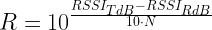
Doubling Time Estimate

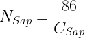
The course assignment also wanted the bacteria doubling time (τ) calculated. Equation 1 shows the derivation of the relationship between doubling time and the exponential growth term (m).

Eq. 1 \displaystyle N=A\cdot {{e}^{{m\cdot t}}}
\displaystyle 2\cdot N=A\cdot {{e}^{{m\cdot \left( {t+\tau} \right)}}}
\displaystyle \frac{{2\cdot N}}{N}=\frac{{A\cdot {{e}^{{m\cdot \left( {t+\tau} \right)}}}}}{{A\cdot {{e}^{{m\cdot t}}}}}
\displaystyle 2={{e}^{{m\cdot \tau }}}
\displaystyle \therefore \tau =\frac{{\ln \left( 2 \right)}}{m}

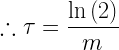
Using Equation 1, we can compute the doubling times for the four test cases shown above.

Figure M: Bacteria Doubling Times.

Figure 5: Bacteria Doubling Times.

Conclusion

This bacterial growth problem provided a good example of how to apply Excel to a simple laboratory data analysis problem.

Posted in Excel, General Mathematics, Health, optics, Statistics | 2 Comments

Estimated Range Between Radios Based on RSSI

Quote of the Day

Something I wish I’d been reminded of when I was learning to code – just watching coding tutorials is like going to the gym just to watch someone else lift weights. It’s valuable to see how experts do it, but to actually build your coding skills—you’ve got to code!

Madison Kanna, software developer. I am a huge fan of her twitter feed and blog. I see many people watch Youtube videos and think that simply watching videos will make them proficient at complex tasks. Unfortunately, there is a huge gap between watching and doing.


Introduction

Figure 1: Illustration of Radio Signal Spreading. (Source: Me)

Figure 1: Illustration of Radio Signal Spreading. (Source: Me)

I recently have been working on Bluetooth Low Energy (BLE) systems and estimating the distance between two devices based on the Received Signal Strength Indicator (RSSI) value is one of my tasks. There are all sorts of uses for this distance information in wireless systems.  A few years ago, I worked on one wireless product for department stores that would use customer distance and angle information to determine where a customer was in the store and where they lingered while they were shopping. This information can be used to assess the 'stickiness' of displays and to send messages to the customer's phone about nearby products they may be interested in.

These types of calculations are also performed in other applications. For example, I have done similar calculations with cell phone systems. While cell towers normally use GPS to determine phone positions, if GPS is not available they can use power-based range estimates to locate phone positions (example). This certainly is part of the E911 standard, which specifies emergency cell services in the US.

All these applications estimate range using some form of Equation 1.

Eq. 1 \displaystyle R={{10}^{{\frac{RSSI_{TdB}-RSSI_{RdB}}{{10\cdot N}}}}}

where

  • R is estimate range between the two radios (in meters).
  • N is the path-loss exponent (unitless, value of 2-4, with 2 being for free space). At most frequencies, N=2. In the case of 2.4 GHz, losses can be higher (link, link).
  • RSSITdB is received signal power level (in dBm) at 1 meter from the antenna.
  • RSSIRdB is received signal power level (in dBm) at R meters range.

This post will present a derivation of Equation 1.

Analysis

Equation 1 is nothing more than the inverse square-law for electromagnetic waves with signal powers expressed in dB and the signal losses modeled with range powers from 2 to 4. We begin the derivation by restating the inverse square law for electromagnetic waves (Equation 2).

Eq. 2 \displaystyle RSSI_R=K\cdot \frac{{{{P}_{T}}}}{{{{R}^{N}}}}

where

    • K is a constant that will cancel out in further work.
    • RSSIR is the received power (W).
    • PT is the transmit power (W).

The range calculations do not normally use the actual transmitted power, but use the received transmit power at a reference distance (usually 1 meter), which is modeled by Equation 3.

Eq. 3 \displaystyle RSSI_T=K\cdot \frac{{{{P}_{T}}}}{{{{1}^{N}}}}

Let's now construct the ratio of Equation 3 to Equation 2 (Equation 4).

Eq. 4 \displaystyle \frac{{{RSSI_T}}}{{{RSSI_R}}}=\frac{{K\cdot \frac{{{{P}_{T}}}}{{{{1}^{N}}}}}}{{K\cdot \frac{{{{P}_{T}}}}{{{{R}^{N}}}}}}={{R}^{N}}

We can convert Equation 4 to dB as shown in Equation 5.

Eq. 5 10\cdot \log \left( \frac{RSSI_T}{RSSI_R} \right)=10\cdot \log \left( R^N \right)
\Rightarrow 10\cdot \log \left(RSSI_{T}\right)-10\cdot \log \left(RSSI_{R}\right)=10\cdot \log \left(R^N\right)
\Rightarrow RSSI_{TdB}-RSSI_{RdB}=10\cdot N \cdot \log \left(R\right)
\Rightarrow \frac{RSSI_{TdB}-RSSI_{RdB}}{10\cdot N }=\log \left(R\right)
\therefore R=10^{\frac{RSSI_{TdB}-RSSI_{RdB}}{10\cdot N}}

This derivation shows that Equation 1 is really just a slight reworking of the inverse square law.

Posted in Electronics, Physics | 4 Comments

Gravity on Von Braun Station

Quote of the Day

Late to bed, early to rise, work like hell, and advertise.

— Wernher Von Braun, a saying he kept on his desk. He was not going to repeat the mistakes of other rocket pioneers who shunned publicity.


Figure 1: Wernher von Braun. (Wikipedia)

Figure 1: Wernher von Braun. (Wikipedia)

I have been reading about Wernher von Braun's work with Disney on popularizing the idea of spaceflight with the public. He was a genius at marketing and a tireless champion for space flight. In addition to his television work, he also gave numerous speeches to any group that would listen. I smile as I think about my high‑school physics teacher beaming with pride when he spoke of von Braun arriving in a helicopter to speak to local physics teachers about space and flying to the moon. My physics teacher could not remember the details of what von Braun spoke about, but his entrance and exit in a helicopter made a huge impression on a town of 1800 people!

Figure 2: Collier's Magazine Cover. (Source)

In addition to his work with Disney on animating spaceflight, he also worked with the legendary space artist Chesley Bonestell on a Collier's magazine article that people still marvel at for its visionary portrayal of spaceflight (Figure 2). He really made spaceflight seem possible.

He even tried writing a novel about spaceflight called Project Mars: A Technical Tale, which is available for free from the Internet Archive. I read the book and it was a slog. I will say it had the most mathematics of any novel I have ever read. The appendix is intimidating.

The early work of von Braun put great emphasis on a space station that rotated to create artificial gravity, which he described in detail in the Disney video shown in Figure 3. This space station concept is often referred to today as von Braun Station. In the video, he says that the space station is wheel-shaped with a 200-foot diameter and that it rotates at 3 revolutions per minute. This is enough information for us to calculate the amount of gravity that the station's occupants will experience.

Figure 3: Von Baun Briefing on His Space Station Concept.

We can compute the level of artificial gravity generated by the space station using the equation for centrifugal acceleration under circular motion (Equation 1).

Eq. 1 \displaystyle {{a}_{c}}=\frac{{{{v}^{2}}}}{r}=\frac{{\overbrace{{{{{\left( {r\cdot \omega } \right)}}^{2}}}}^{{{{v}^{2}}}}}}{r}=\frac{{{{{\left( {r\cdot 2\cdot \pi \cdot f} \right)}}^{2}}}}{r}=4\cdot {{\pi }^{2}}\cdot r\cdot {{f}^{2}}

where

  • ac is the centripetal acceleration (artificial gravity).
  • r is the radius of the space station.
  • f is the rotation frequency.
  • ω is the angular frequency.

We can compute the level of artificial gravity as shown in Figure 3.

Figure 3: Calculation of Space Station Acceleration.

Figure 3: Calculation of Space Station Acceleration.

So this space station concept would generate ~30%⋅g. This level of gravity is similar to that of Mars, which has 38% of the surface gravity of Earth.

I should mention that a very limited experiment with artificial gravity was attempted with the Gemini 11 mission and the Agena docking target they were using for practice. The experiment generated only 0.0005 · g (link), but it was a successful test (note that some sources report 0.00015.· g).

Figure 4: Gemini-Agena Artifiicial Gravity Experiment.

Figure 4: Gemini-Agena Artificial Gravity Experiment.

We can confirm the level of gravity generated with the calculation shown in Figure 5.

Figure 5: Gemini Gravity Calculation.

Figure 5: Gemini Gravity Calculation.

Figure 6 shows a photo of the Agena tethered to Gemini 11.


Figure 6: Agena Tethered to Gemini 11.

Figure 6: Agena Tethered to Gemini 11. (NASA)

Posted in Space | 6 Comments

The Amazing de Havilland Mosquito

Quote of the Day

In 1940 I could at least fly as far as Glasgow in most of my aircraft, but not now! It makes me furious when I see the Mosquito. I turn green and yellow with envy. The British, who can afford aluminium better than we can, knock together a beautiful wooden aircraft that every piano factory over there is building, and they give it a speed which they have now increased yet again. What do you make of that? There is nothing the British do not have. They have the geniuses and we have the nincompoops. After the war is over I'm going to buy a British radio set – then at least I'll own something that has always worked!

Herman Göering, Germany’s wartime aviation minister (Source)


Introduction

Figure 1: de Havilland Mosquito fighter-bomber.

Figure 1: de  Havilland Mosquito fighter‑bomber. (Wikipedia)

During the routine demolition of an old de Havilland Aircraft building in 2017, a treasure trove of 20K aperture cards (a microfilmed archive) was uncovered that contained plans for the Mosquito fighter-bomber (Figure 1). These plans have been lost since Mosquito production ended in  1950.

This discovery was a gold mine for WW2 aviation buffs. While nearly 8000 Mosquitos were produced, few have survived. Its wooden construction requires meticulous care to preserve and only four airworthy Mosquitos remain (link). Flying these old birds can be very dangerous, with two Mosquito pilots killed back in 1996 (link). The recovered plans are now being used to build a new Mosquito known as the "The People's Mosquito." With a bit of luck, a new Mosquito should be flying in a few years.

In this post, I will be looking at Mosquito production using Excel. For those who like to follow along, you can download my Excel workbook here. This workbook processes serial number data from a De Havilland historical web page.

Discussion

Mosquito Role

Figure 2: Mosquito Production By Role.

Figure 2: Mosquito Production By Role.

The Mosquito was produced in the following variants:

In many ways, the Mosquito was the ultimate multi-role aircraft. Even though propeller-driven, it proved useful enough to the UK to remain in production until the end of 1950 (link).

Table 1 shows the production numbers by role. Night fighter and fighter-bomber were roles filled by 2/3 of the production.

Table 1: Mosquito Production By Role.
Category Quantity
Fighter-Bomber 3219
Night Fighter 1940
Bomber 1411
Photoreconnaissance 720
Trainer 421
Torpedo Bomber 66
Prototype 1
Grand Total 7778

As is often the case with WW2 data, different sources have different totals. The source used in this post (link) shows 7778 units while other sources list 7781, a discrepancy of 3 units, which I view as minor.

Critical Woodworking Technologies

The Mosquito is a superb example of an aircraft design tailored to use the resources available, particularly those resources associated with wood construction. The Germans tried to build wooden aircraft because they were short of critical raw materials like aluminum. However, Germany's wooden aircraft attempts were unsuccessful in part because they lacked two key technologies that the UK had:

  • Resorcinol Adhesive
    The Mosquito's wooden members were glued together using resorcinol adhesive, which was an adhesive technology the German's did not have. The German's also tried to make wooden aircraft (He 162, Bachem Natter) but failed with one major reason being the lack of an adequate adhesive.
  • Plywood Laminated UsingResorcinol Adhesive
    The UK worked with US plywood manufacturers to develop plywood that was laminated using resorcinol glue. Prior to WW2, the US was manufacturing large quantities of marine plywood for use in the manufacture of civilian boats and wartime-production of PT boats and landing craft. De Havilland sought out US manufacturing that could build structural-grade plywood to their exacting specifications. They settled on a manufacturer in Wisconsin (link), who then went out and bought an estate loaded with virgin timber.

Manufacturers

A key motivation for building the Mosquito out of wood was that it would allow the UK to use its well-trained woodworking population to work on a strategic need. The Mosquito's design was robust enough that it could be built at nine sites in three different countries. Table 2 shows a summary of where the Mosquitos were assembled and in what quantities.

Table 2: De Havilland Mosquito Manufacturing Sites.
Country Production Site Quantity
UK 6433
Hatfield 3309
Leavesden 1576
Standard Motors 1066
Percival 245
Airspeed 122
Chester 65
Hatfield: Chester 50
Canada 1133
Toronto 1133
Australia 212
Bankstown 212
Grand Total 7778

Figure 3 shows Mosquito production by year during WW2. Wartime production was 5938 (source). Note that some sources list higher production figures during WW2 (example: 6710). I have defined WW2 production as terminating on VJ Day, so 1945 was a shortened production year.

Figure M: Wartime Mosquito Production By Year.

Figure 3: Wartime Mosquito Production By Year.

Many of the structural components were assembled by furniture manufacturers at High Wycombe from imported plywood (link).

Figure 4 shows a good video on how the Mosquito was manufactured, with much of the aircraft being made from wood.

Posted in History Through Spreadsheets, Military History | 4 Comments

USNS Comfort Bed Count Relative To Other US Hospitals

Quote of the Day

The more a man rises in leadership the more responsible he is not just for what he says but also for what people hear.

General Michael Hayden


Figure 1: USNS Comfort is now berthed in New York City. (Wikipedia)

Because of COVID-19, I am currently sheltering-in-place at my cabin in northern Minnesota. I was reading news reports of the USNS Comfort docking in New York City to provide the city with another 1000 bed hospital. I had no idea as to the average size of a hospital and decided to take a quick look at the number of beds in hospitals around the United States using a histogram.

Fortunately, the Department of Homeland Security (DHS) makes an enormous amount of US infrastructure data available online at the Homeland Infrastructure Foundation-Level Data (HIFLD) website.  On this webpage, you can find details on all the hospitals in the US. As always, there are issues with the data. For example, while it only has bed counts for 6919 hospitals out of the 7581 hospitals in its list. My graph will filter out the hospitals that have no bed count data, which are listed in the file as having -999 beds. For those who are interested in looking at my Excel workbook, it is available here.

The government database lists the following types of hospitals in the US:

  • Children's
  • Chronic Disease
  • Critical Access (rural hospitals)
  • General Acute Care
  • Long-Term Care
  • Military
  • Psychiatric
  • Rehabilitation
  • Special
  • Women's

I am only interested in the General Acute Care and Critical Access types of hospitals, of which there are 5263. These are the hospitals that would bear the brunt of caring for COVID-19 victims. Figure 2 shows the number of US hospitals by bed count.

Figure 2: US Hospital Bed Count Distribution.

Figure 2: US Hospital Bed Count Distribution.

Here is what Figure 2 tells me that:

  • USNS Comfort's 1000 beds put her in the top 0.6% of hospitals in the US by bed count. It is a major hospital by any measure.
  • The bulk of US hospitals (~71%) have less than 200 beds.
  • 90% of US hospitals have less than 400 beds.

I should mention that the USNS Comfort has a sister ship called the USNS Mercy, which is the lead ship of the Mercy class of hospital ships. Both ships are converted supertankers originally built to service the trans-Alaska pipeline.

Posted in Civics Through Spreadsheets, Excel | 3 Comments

Maple Sap is Sweet This Year

Quote of the Day

Statistics are like brief swimming costumes; what they reveal is interesting, but what they conceal is absolutely vital.

— old statistics professor


Figure 1: My Neighbor's Maple Syrup Bag.

Figure 1: My Neighbor's Maple Syrup Bags.

I am being a good citizen and socially distancing myself by staying at my cabin in northern Minnesota – avoiding people is easy in the dense forest that surrounds my residence. When I went out for my daily walk today, I saw that my neighbor had put out maple sap bags (Figure 1). Most folks around here collect their sap in these blue bags.

Some of my fondest boyhood memories are of my father driving the tractor that was pulling a trailer on which my grandfather and I sat on while going from tree to tree gathering pails of maple sap.

My brother has also been collecting sap this spring and he is reporting that it is taking 30 gallons of sap to obtain one gallon of syrup, which is better than the 40-to-1 ratio that he usually reports. This means the sap is a bit sweeter this year than last. Maple syrup typically has a sugar content greater than 66%, but maple sap typically has a sugar content of about 2.5% but can vary anywhere from 1% to 5%.

You can estimate the amount of sap you will need to make a gallon of maple syrup using the Jones Rule, or Rule of 86 (Equation 1). As an example of using the Rule of 86, given a 2.5% sugar concentration sap, you will need 86/2.5 = 34 gallons of sap to make 1 gallon of maple syrup.

Eq. 1 \displaystyle {{N}_{{Sap}}}=\frac{{86}}{{{{C}_{{Sap}}}}}

where

  • NSap is the number of gallons of maple sap per gallon of syrup.
  • CSap is the sugar concentration of maple sap expressed in percent.
Posted in Cabin, Personal | Comments Off on Maple Sap is Sweet This Year

WW2 Fighter Aircraft Fuel Fraction

Quote of the Day

Just because you had it rough does mean you need to inflict that mentality on subordinates – there's no pride to be had in suffering for the sake of suffering. Subordinates do not need to carry your burdens to have high quality of work ethic.

— Slide from Air Force briefing on training. I could not agree more. I have seen far too many people made to suffer because someone just wanted to be cruel.


Introduction

Figure 1: Air Force fighter pilot who played a key role in developing modern fighter plane designs.

Figure 1: Air Force fighter pilot who played a key role in developing modern fighter plane designs. (Source)

I recently read a book called Boyd: The Fighter Pilot Who Changed the Art of War that documents the life of John Boyd, a fighter pilot who was critical to putting fighter aircraft design on a firm mathematical footing now called Energy-Maneuvering Theory. He was a key member of the Fighter Mafia, a group of military and industry experts in the 1970s that advocated for a lightweight fighter alternative to the large, heavy fighters like the F-111 and MiG-25. Their concepts played a significant role in the final designs of the F-16 and F-18.

Boyd also had an impact on modern management with his advocacy of a nimble decision-making strategy called the Observe-Orient-Decide-Act (OODA) loop that has become doctrine in many military, legal, and corporate circles. I certainly encountered this approach in numerous corporate management situations.

One fighter metric that Boyd used was called the fuel fraction, which is defined as the ratio of fuel weight to the plane's take-off weight.  In theory, this metric should provide an indication of the range of the fighter. I became curious as to how the fuel fraction of WW2 fighters compare with modern fighters. No sophisticated data analysis here, just some simple digging in various airplane databases and putting the data into a spreadsheet, which can be downloaded here.

Background

Overview

Modern fighter aircraft have fuel fractions in the 30% range. For example, the F-22 has a fuel fraction of 29% and the Eurofighter Typhoon has a fuel fraction of 31% (reference). I was curious as to what the fuel fraction was of US WW2 fighters, so I decided to do a little research.

Definitions

There are numerous terms in the specifications that are not always used consistently. Here is my take on these terms.

Combat Radius
Out and back range of an aircraft loaded for combat, including a budgeted time for combat. There appears to be no standard definition for this term, so it cannot be used to compare different aircraft.
Empty Weight
The empty weight of an aircraft is the weight of the aircraft without passengers or fuel, but with unusable fuel, full operating fluids, and full engine oil. (link)
Ferry Distance
For the purposes of this post, the one-way range of an aircraft without drop tanks. The aircraft is configured for maximum range and has minimum or no weapons load. You will find references that do refer to ferrying aircraft during wartime with drop tanks. I have tried to find references for ferry range that did not use drop tanks.
Fully Loaded Weight
Takeoff weight of an aircraft under normal circumstances, which includes fuel and typical weapons load.
Transfer Distance
Same as ferry range.

Methodology

I thought my research would involve simply reviewing various aircraft specifications. However, few sources agreed on any of the specifications for range. I ended up taking the minimum ferry distance from contemporaneous military sources or books on these aircraft. Once I had the ferry range, I simply divided the internal fuel weight by the takeoff weight to get the fuel fraction.

For this exercise, I examined some of the most common US fighters, plus the Japanese Zero. I added the Zero because it was famous for its long range.

I should note that WW2 fighters often used drop tanks for both combat and ferry flights. There were numerous drop tank configurations and I decided to focus on the internal fuel capacities and on the one-way maximum range on internal fuel to keep things simple.

Analysis

There is nothing sophisticated in this work – simple research, organizing, and plotting. Figure 2 shows my scatter plot of a small sample of WW2 fighters.

I was hoping to see a correlation between the ferry range and fuel fraction, but I see no strong relationship. It is interesting to note that most of the fighters had fuel fractions around 12%, which is much less than the fuel fraction of modern jet fighters.

Figure 2: Fuel Fraction versus Ferry Range.

Figure 2: Fuel Fraction versus Ferry Range.

It is interesting to note that the two fighters with the longest ferry range were the F6F-3 (Hellcat) and the A6M2 (Zero). These were fighters designed specifically to operate from carriers in the Pacific where distances were very long. Note that the fuel fraction of the Hellcat was relatively low, while the fuel fraction of the Zero was relatively high.

Conclusion

The fuel fractions for US fighters during WW2 appears to be  ~12%, which is substantially less than the ~30% value often seen with modern fighters.

Posted in Excel, History Through Spreadsheets, Military History | 2 Comments

Combined Excel Timeline/Column Chart using WW2 Naval Air Data

Quote of the Day

I'd rather fly in a Spitfire but fight in a Hurricane - because the Hurricane was made of non-essential parts. I had them all shot off at one time or another, and it still flew just as well without them.

James 'Ginger' Lacey of 501 Squadron, who was the second-highest ace from the Battle of Britain.


Introduction

Figure 1: F6F Hellcat, fighter that dominated US carrier sorties in the later part of the Pacific War.

Figure 1: F6F Hellcat, the fighter that dominated US carrier sorties in the later part of the Pacific War.

I recently needed to generate a graph in Excel that combined a column chart with a timeline. The graph turned out well and I decided to share my work here. As my original work is proprietary, I will share the technique here using some US Navy (USN) air operations data from WW2.

I OCRed Table 5 of the WW2 Naval Aviation Combat Statistics (NASC) report, which contains both monthly squadron numbers and action sorties flown by month. I filtered the data to show the sum of the fighter (Wildcat, Hellcat, Corsair) and bomber (Dauntless, Helldiver, and Avenger) sorties.

For those who like to follow along, my workbook is here.

Background

I prepared a column chart of the monthly fighter and bomber sorties. I also added a timeline of major battles to provide some context for the number of sorties. The date ranges of the major battles were obtained from the Wikipedia.

The NASC separated the sortie data into carrier-based and land-based categories.

Analysis

Data

I used Tabula to grab Table 5 from the NASC and output a CSV file. I then used Power Query to clean the data and to prepare it for graphing.

Graph

Figure 2 shows my plot of carrier and land sorties versus time in the chart's upper half and the battle timeline on the chart's lower half. This graph nicely illustrates that:

  • Until late-1943, the USN had relatively few sorties per month compared to the first few months of 1945.
  • The Battles of Coral Sea, Midway, and Guadalcanal can be seen on the graph, but have relatively few sorties compared to the Battles of Manila, Iwo Jima, and Okinawa.
  • There is a long carrier sortie drought during most of 1943.

Figure 2 shows very clearly that the USN needed ~18 months to build itself into a navy that could take on the IJN at sea.

Figure 2: Sorties vs Time with Timeline.

Figure 2: Sorties vs Time with Timeline.

Conclusion

While I do not like to use Excel for graphics, it does allow you to easily combine different chart types. This can be useful for some types of presentations, such as this one.

Posted in Excel, History Through Spreadsheets, Military History | Comments Off on Combined Excel Timeline/Column Chart using WW2 Naval Air Data

Web Scraping Sailboat Reviews Using Power Query

Quote of the Day

The real problem of humanity is the following: we have paleolithic emotions; medieval institutions; and god-like technology.

E.O. Wilson


Figure 1: The Seawind 1600 was a top vote getter.

Figure 1: The Seawind 1600 was a top vote-getter. (Source)

While it is true that I worked on US Navy contracts for twelve years and spent some time on ships testing new underwater vehicles, I know very little about recreational boating. However, I have always been fascinated by sailing, though this fascination has been limited to reading books about the Age of Sail.

Recently, my wife and I have become huge fans of three sailing channels on Youtube that may cause me to take up sailing when I retire (about five years away). Here are my reviews of these three channels:

  • Sailing Ruby Rose
    Nick and Terysa and their Southerly 38 monohull sailboat seem to have the most diverse sailing experience. For example, I was utterly fascinated with how they took down their mast, pulled up their keel, and used their sailboat to cruise the canals of France. Their style of presentation is the most journalistic of the three shows in that they matter-of-factly present a large amount of interesting information.
  • Gone With the Wynns
    Jason and Nikki Wynn sail the Pacific with their Leopard 43 catamaran sailboat, which they purchased before learning to sail. I could never imagine myself being so bold.  The show is the best produced of the three programs. Nikki is a first-rate narrator and Jason is a professional photographer. His skills really show. The show is beautifully filmed and edited. His use of the drone for aerial shots is superb. These two are fun to watch because you get to see them learning as they go. I am particularly impressed with their worldwide network of helpers.
  • The O'Kelly's
    Nick and Megan O'Kelly and their Leopard 46 catamaran sailboat cruise the east coast of the US and the Carribean. Nick is a lifelong sailor and former TV weatherman. He has significant presentation skills and his talks are the most technical in terms of navigation and weather. Since my life is a celebration of detail, I love seeing his explanations of weather and how he plans sailing routes. Megan appears both in their sailing videos and she also has her own video channel where she covers non-sailing topics, like health and sewing. I enjoy this channel as well. I particularly like her sewing projects (my sewing has been limited to a few upholstery projects and a quilt).

Sailboat Survey

The Ruby Rose crew is selling their current boat and did a very interesting analysis of the boats they were considering purchasing as a replacement. Not only did Nick and Terysa review the boats, but they invited their viewers to review the boats.

Here are links to the sailboat review pages. While a good format, I wanted to see all the results in a cross-tabulated table.

Table 1: Sailboats Reviewed By Ruby Rose.
St Francis 50 Majestic 530 Seawind 1260 Knysna 500SE Maverick 440
Balance 526 Antares 44 GS Xsquisite X5 Discovery 50 Excess 12
Catana 53 Outremer 51 Privilege 5.0 Neel 47 NautiTech 46
Leopard 45 Astrea 42 Seawind 1600 Lagoon 42

Because the data is scattered across nineteen pages, I decided that I needed to do a bit of web scraping using Power Query. You can download my Excel workbook here.

The boats were assigned grades (1-10) in the following categories:

  • Performance
  • Interior Design
  • Build Quality
  • Safety and Design
  • Value for Money

The final grade was assigned by simply summing the total scores, which implicitly gives each category an equal weight. I wanted my data in a spreadsheet so that I could weight the categories differently. For example, I would like to give Safety and Design and Build Quality more weight than Performance and Interior Design.

Audience Assigned Grades

Table 2 shows the results from their survey of people who watch their channel. Each boat had been the subject of a separate video that allowed their audience to get a good look at each boat.

Table 2: Ruby Rose Sailboat Reviews

BoatPerform-
ance
Interior DesignQualitySafety/
Design
ValueTotal
Xsquisite X55.307.808.508.206.1035.90
Seawind 16007.806.807.607.606.0035.80
Balance 5268.006.807.707.604.4034.50
Seawind 12606.906.206.807.107.1034.10
Knysna 500SE6.206.807.007.206.9034.10
Outremer 518.106.407.606.905.0034.00
Privilege 5.05.107.608.707.904.6033.90
St Francis 505.807.007.907.705.3033.70
Leopard 455.607.006.807.206.3032.90
Discovery 505.007.308.107.604.6032.60
Maverick 4405.706.107.207.106.5032.60
Catana 53.7.206.507.106.604.9032.30
NautiTech 466.306.706.506.306.2032.00
Antares 44 GS4.906.208.107.804.8031.80
Lagoon 424.706.906.306.606.1030.60
Majestic 5304.306.907.206.905.3030.60
Astrea 425.006.805.105.905.2028.00
Excess 124.405.004.905.204.5024.00
Neel 476.804.302.905.104.0023.10

Nick and Terysa's Vote

Nick and Terysa also shared the grades they assigned to the boats, which I show in Table 3.

Table 3: Ruby Rose Crew Scoring.

BoatPerform-
ance
Int. DesignQualitySafety
Design
Value Total
Seawind 160098910642
Balance 526981010542
Outremer 5189108540
Catana 53.8998539
Knysna 500SE6899739
Xsquisite X52101010638
Majestic 53041099638
Seawind 12607789738
Maverick 4405799636
St Francis 50551010636
Discovery 50310109436
Privilege 5.058109335
Antares 44 GS471010334
NautiTech 466876633
Lagoon 424687530
Leopard 454767529
Astrea 424846426
Neel 478616526
Excess 123566424

Posted in Excel, Personal | Comments Off on Web Scraping Sailboat Reviews Using Power Query

Visualizing House of Representative Data Using Power Query

Quote of the Day

Success is never due to one thing, but failure can be. Sleeping well won’t make you successful, but not sleeping enough will hold you back. Hard work is rarely enough without good strategy, but even the best strategy is useless without hard work. Many things are necessary, but not sufficient for success.

James Clear


Introduction

Figure 1: Pivot Table Showing How Minnesota representatives for House Ammendment 789 to BIll HR 2546.

Figure 1: Pivot Table Showing How Minnesota representatives for House Amendment 789 to Bill HR 2546.

I have been following certain bills through the US House of Representatives and wanted to know how the voting varied by US regions and political parties. I also want to generate tables that show how my state's representatives vote (Figure 1). Fortunately, the votes are documented online and Power Query was able to easily grab and process the data.

The government does a decent job of graphically presenting the data but I wanted to view the data a bit differently than how they did because I want to:

  • Quickly be able to look at how my state's congressional representatives voted
  • See how the voting varied US region and party
  • See the votes of only congressional representative – the online data includes delegates from US territories if the votes will not change the pass/fail results

This post provides a workbook that can be used to:

  • graphical view the voting results by US region and party
  • filter the data to view the votes by state delegation
  • graphical view of the voting without including the territorial delegates

Background

The online data is well-formatted:

  • Votes of the US House and Senate are listed here
  • US House data includes the district number and party of each representative
  • Territory delegates are also included if their voting does not affect the vote outcome

There is one minor issue involving how votes are recorded. An affirmative vote may be recorded as "Yes" or "Aye." A negative vote may be recorded as "No" or "Nay." Also, some representatives choose not to vote, either through absence or simply deciding not to vote.

Because the US House and Senate data is formatted differently, I have chosen to restrict my workbook to processing only House data. My processing plan is straightforward:

  • Use Power Query to download the data
  • Filter the data to remove territorial delegates (if needed)
  • Augment the data with US region information using region designations from the US Census Department

The workbook is available here.  It does contain a small, button-activated macro that updates all the queries and pivot tables.

To use the workbook, you must:

  • go to the list of votes
  • copy the link to the US House vote (NOT Senate) you are interested in
  • paste the link into the vote link location on the Report tab of the workbook.

This processing sequence leaves me with a tidy table that I then use to generate pivot tables and charts.

Analysis

I randomly chose a bill that went through the House recently that involved adding some wilderness lands (HR  2546, Amendment 789). I wanted to see how the vote results varied by party and region of the US.

Figure 2 shows that the bill passed but the voting was along party lines. The graph in Figure 2 is my duplication of a similar graph on the government website. The only difference in my plot is that I removed the non-voting delegates.

Figure 2: House Vote Totals Summarized By Party.

Figure 2: House Vote Results Summarized By Party.

Figure 3 shows how the voting results varied by region. Again, it is very clear that the voting was along party lines in all regions of the US.

Figure 3: Vote Summary By Region and Party.

Figure 3: Vote Summary By Region and Party.

Conclusion

I was able to view the data for a US House bill that I was interested in. Figure 3 shows how polarized the US is nationally right now. Figure 4 shows that the Colorado House delegation was also polarized.

Figure 4: Colorado Voting Breakdown By Party.

Figure 4: Colorado Voting Breakdown By Party.

My home state of Minnesota's House delegation was also polarized (Figure 5).

Figure 5: Minnesota Delegation was also Polarized.

Figure 5: Minnesota Delegation was also Polarized.

Posted in Civics Through Spreadsheets, Excel | Comments Off on Visualizing House of Representative Data Using Power Query